U.S. Chamber of Commerce Growth Engine Report
REPORT DESIGN AND LAYOUT
The Center for Capital Markets Competitiveness’ (CCMC) mission is to advance America’s global leadership in capital formation by supporting diverse capital markets that are the most fair, transparent, efficient, and innovative in the world. CCMC advocates on behalf of American businesses to ensure that legislation and regulation strengthen our capital markets allowing businesses—from the local flower shop to a multinational manufacturer—to mitigate risks, manage liquidity, access credit, and raise capital.
The challenge with this project was to develop a design depicting the sprawling topics of this report while conveying optimism about financial recovery through innovation. I used custom isometric designs, bright colors and subtle gradients to illustrate the different major economic components, while making the content appealing and relatable.
COLORS
PROGRAMS USED


Pitch Deck Template
PRESENTATION DESIGN AND LAYOUT
This bright, modern pitch deck template is the result of upcycling an unused client branding concept. I overhauled the typography and color palette to build a versatile presentation system focused on clean data visualization and clear storytelling.
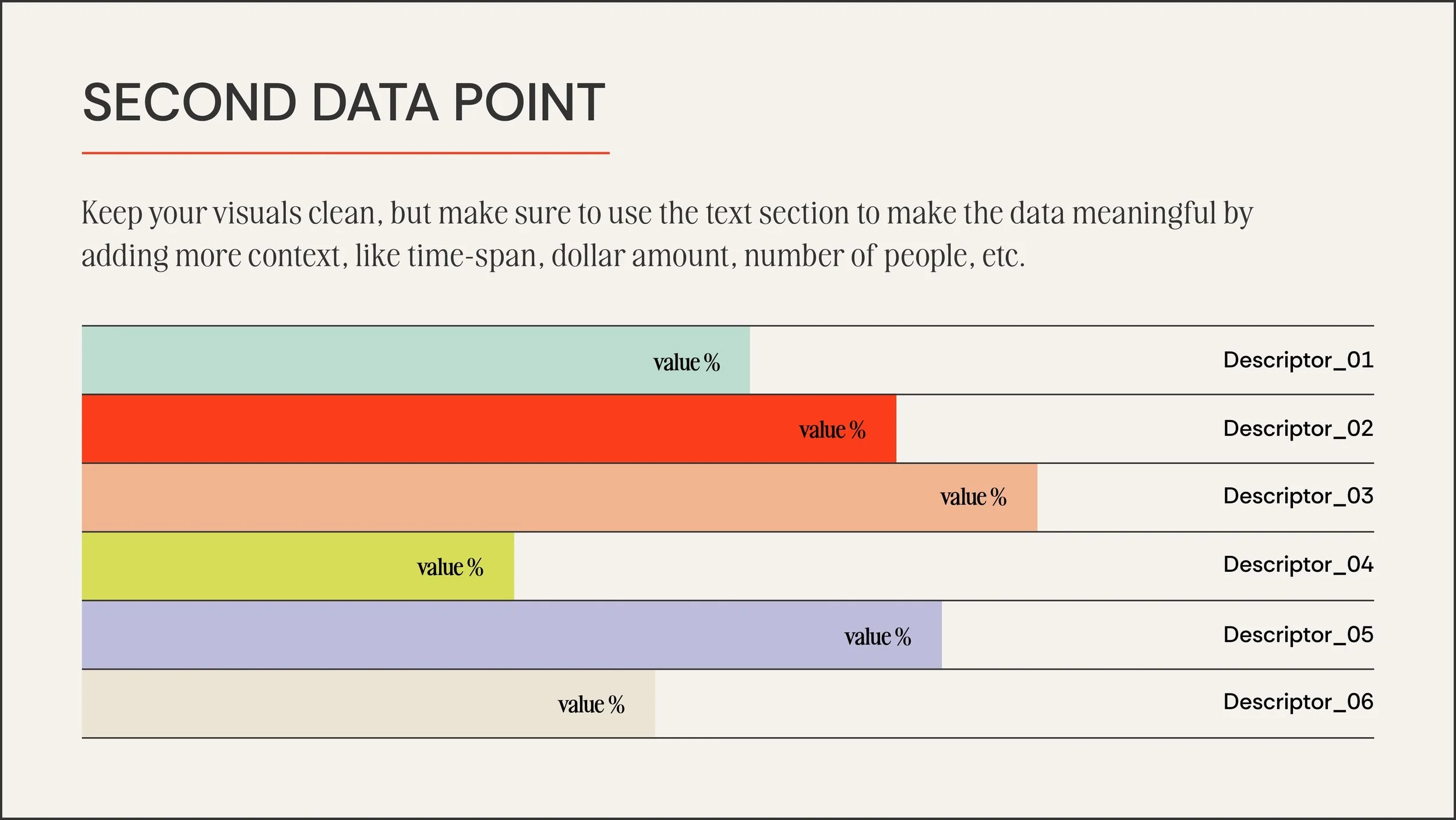
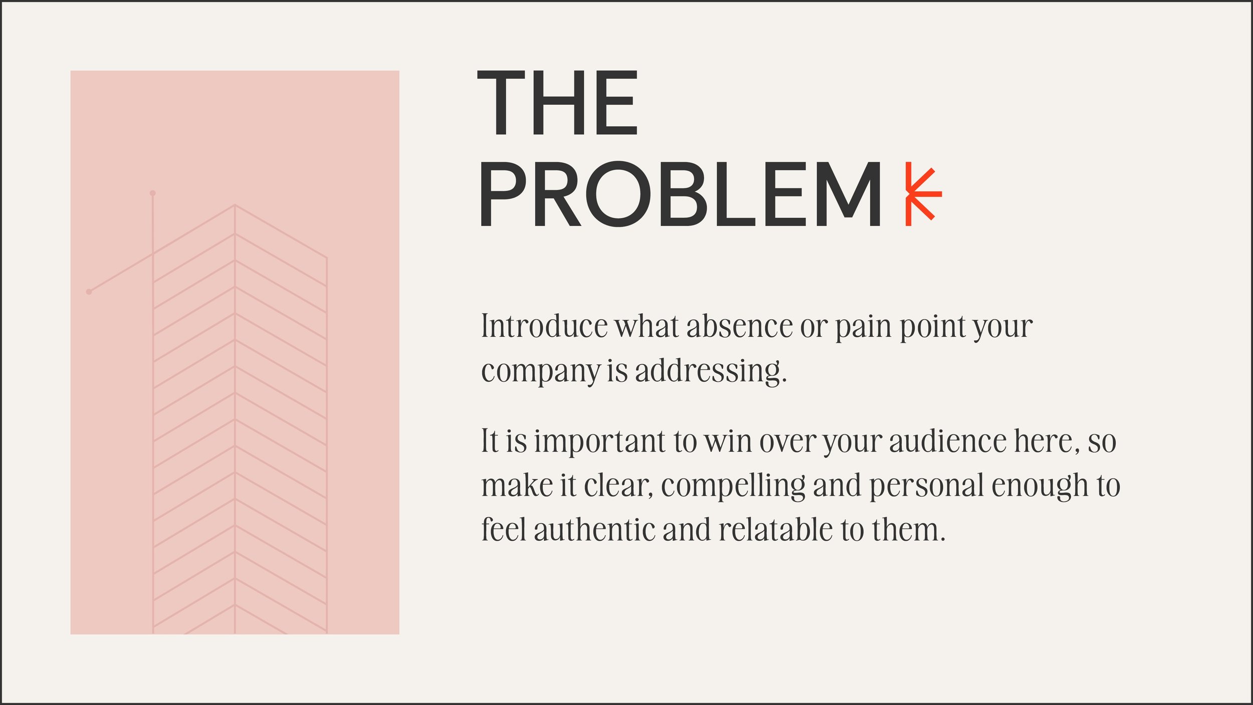
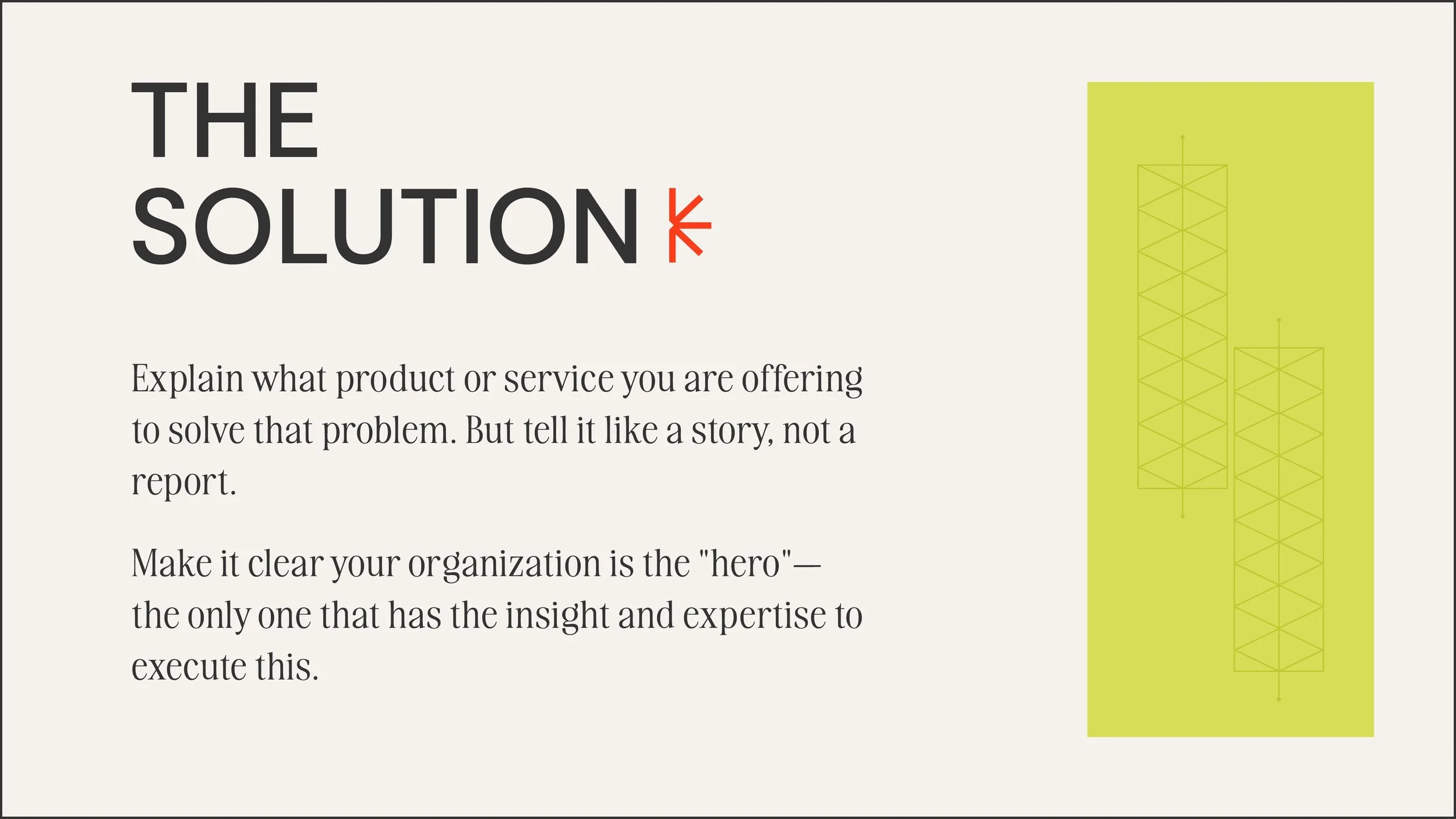
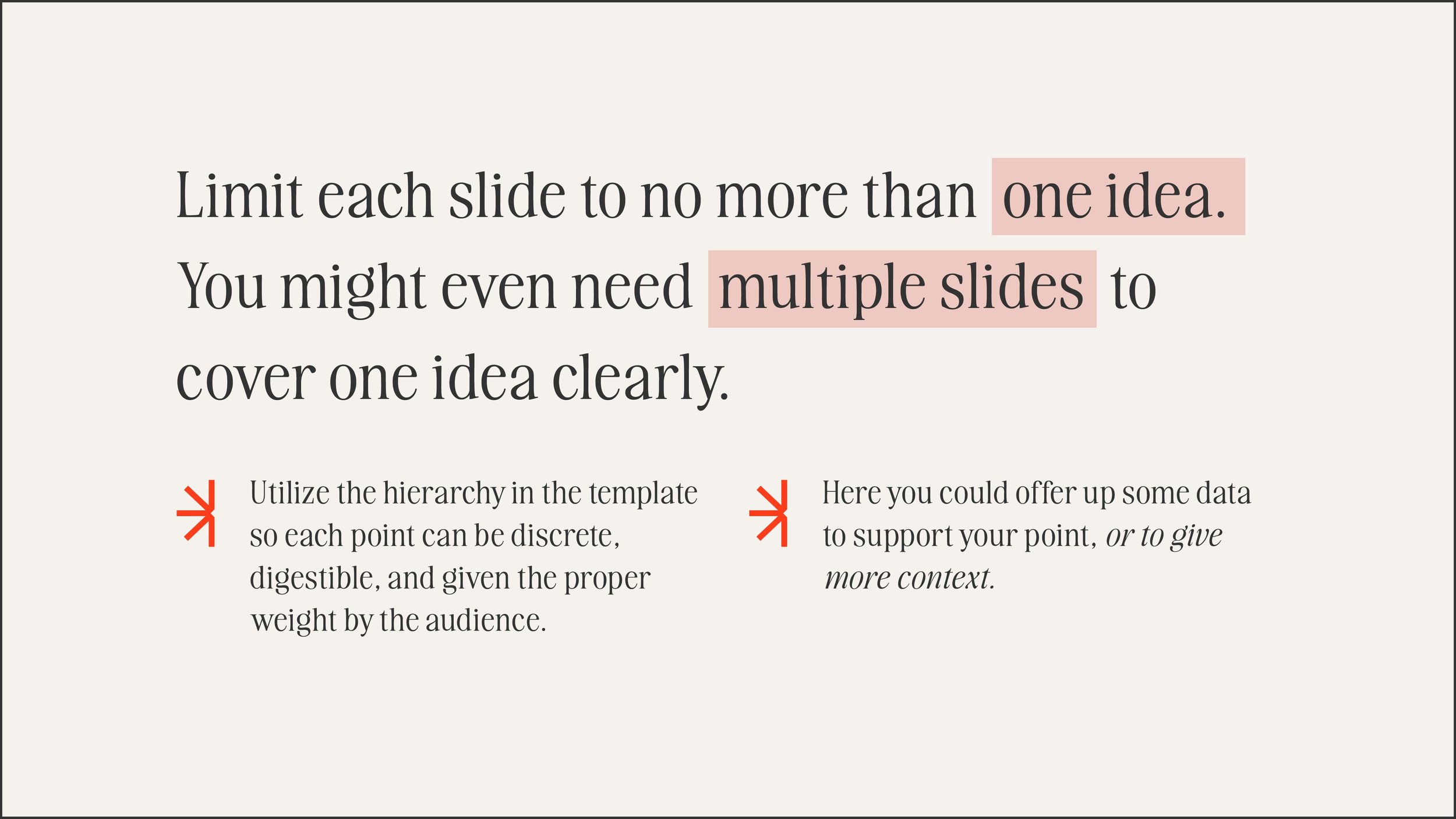
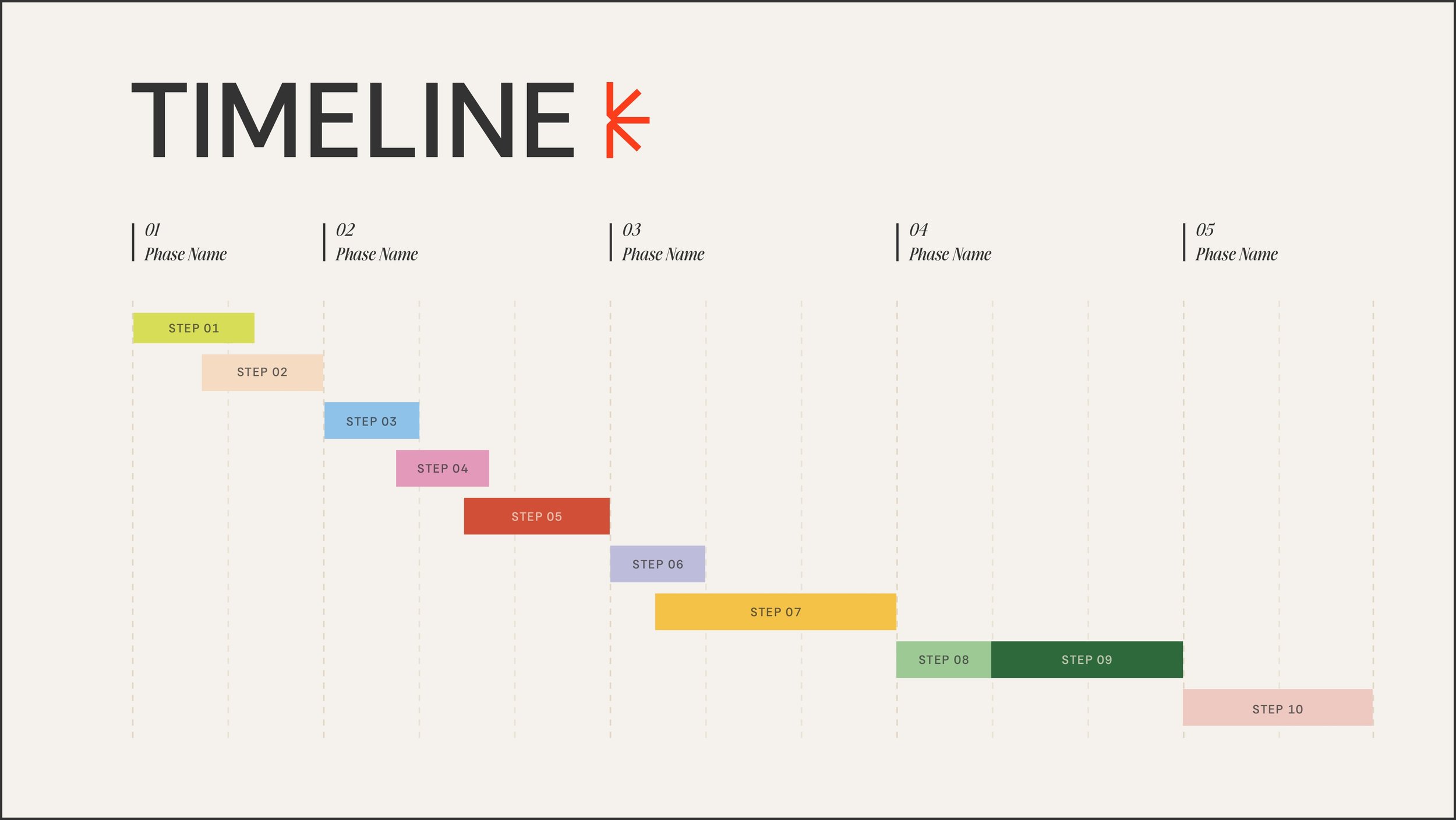
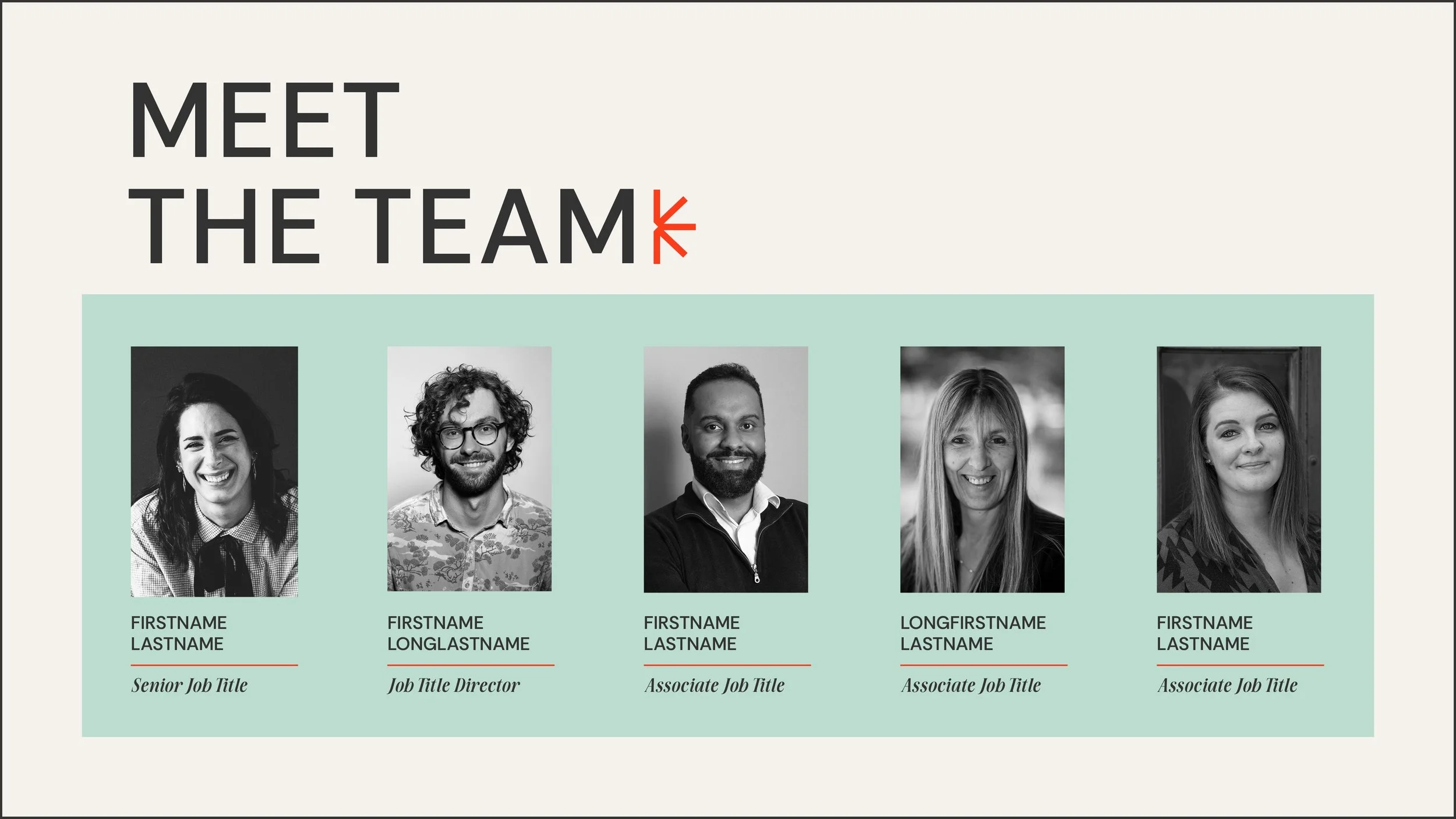
The template features a strong visual hierarchy designed to make information highly digestible, ensuring each slide focuses on just one key idea. From timeline visualizations to dedicated narrative slides for defining problems and solutions , it provides a polished, structured framework for any brand to tell a compelling story.
COLORS
PROGRAMS USED

Policies to Take Advantage of Falling Solar Hardware Costs
REPORT DESIGN AND LAYOUT
The Abundance Institute is a mission-driven nonprofit focused on creating space for emerging technologies to grow, thrive, and have a chance to reach their full potential. Their energy division focuses on highlighting new technologies and identifying the outdated or poorly-crafted regulation that unintentionally limits benefits of innovation to people and the natural world.
I started working with this organization as a freelancer before they had launched. They had just finalized their brand identity, and I was tasked with developing a cohesive library of assets that were faithful to the brand guidelines, but flexible enough to adapt as the Abundance Institute grew. This was especially challenging because the brand had to seem edgy enough to their tech audience, credible enough for their legislative audience, and traditional enough for their academic audience. I found common ground with white space, minimalism, and strategic use of their bold, primary color palette.
COLORS
PROGRAMS USED