GNAR
PROJECT: Branding
CLIENT: Self-Initiated/Conceptual
ROLE: Art Direction ▪ Brand/Visual Identity ▪ Copywriting
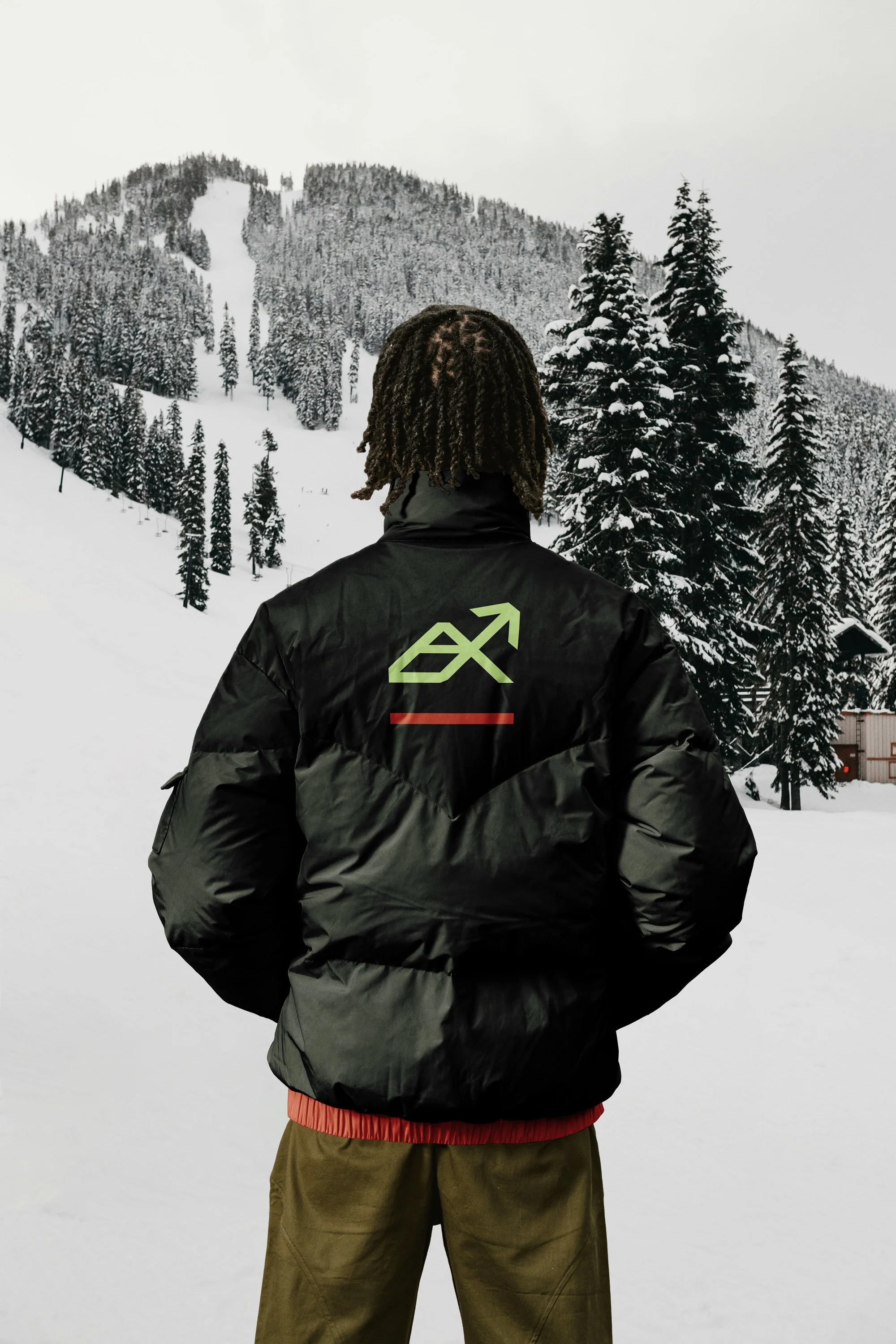
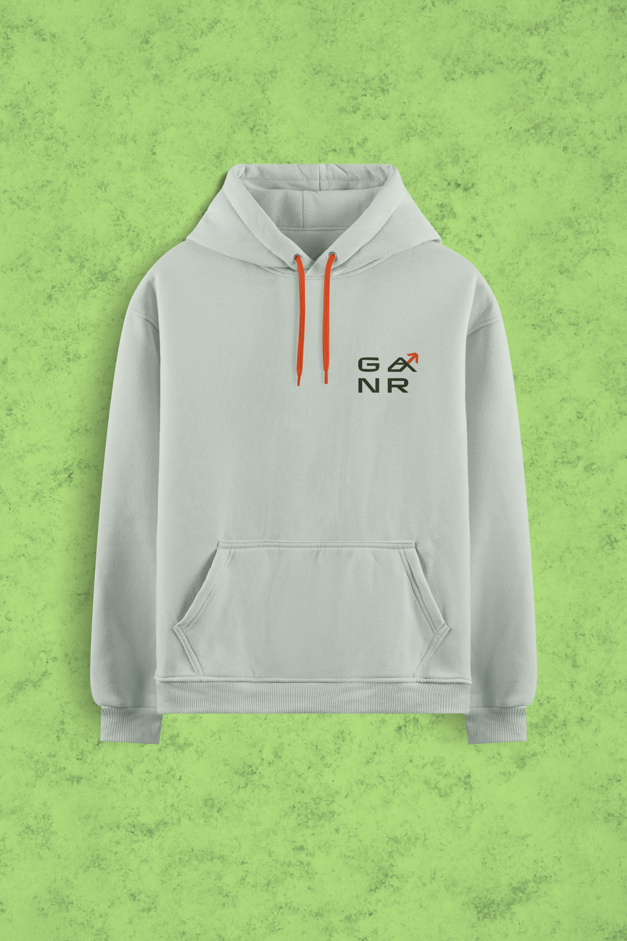
Snowboarding culture lives at the intersection of high-stakes performance and a laid-back, creative spirit. The challenge for GNAR, a Truckee-based apparel company, was to create a visual identity that resonates with the 'core' mountain athlete while appealing to the broader lifestyle consumer. The goal was to build a brand that feels as at home in a technical backcountry setting as it does in a casual urban environment.
The solution is a logo mark rooted in geometric momentum. By merging the silhouette of a mountain peak with the structural shape of the brand’s 'A,' I developed a mark that symbolizes both the ascent and the descent. The clean, bold lines offer the scalability required for technical gear—from laser-etched hardware to embroidered outerwear—ensuring brand recognition across diverse textures and scales. To balance the mark's precision, the color palette utilizes a high-contrast 'Evergreen' to anchor the brand in nature, while 'Electric Lime' and 'Bold Red' provide the high-visibility energy synonymous with mountain culture. This creates a versatile identity system that values quality over convenience, speaking to an audience that prioritizes both technical performance and authentic style.
COLORS
PROGRAMS USED


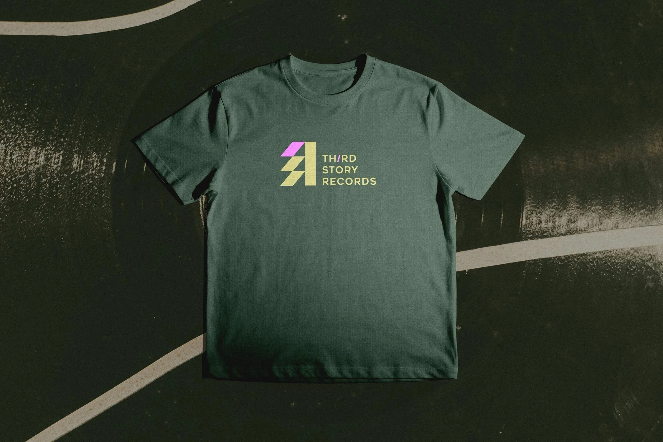
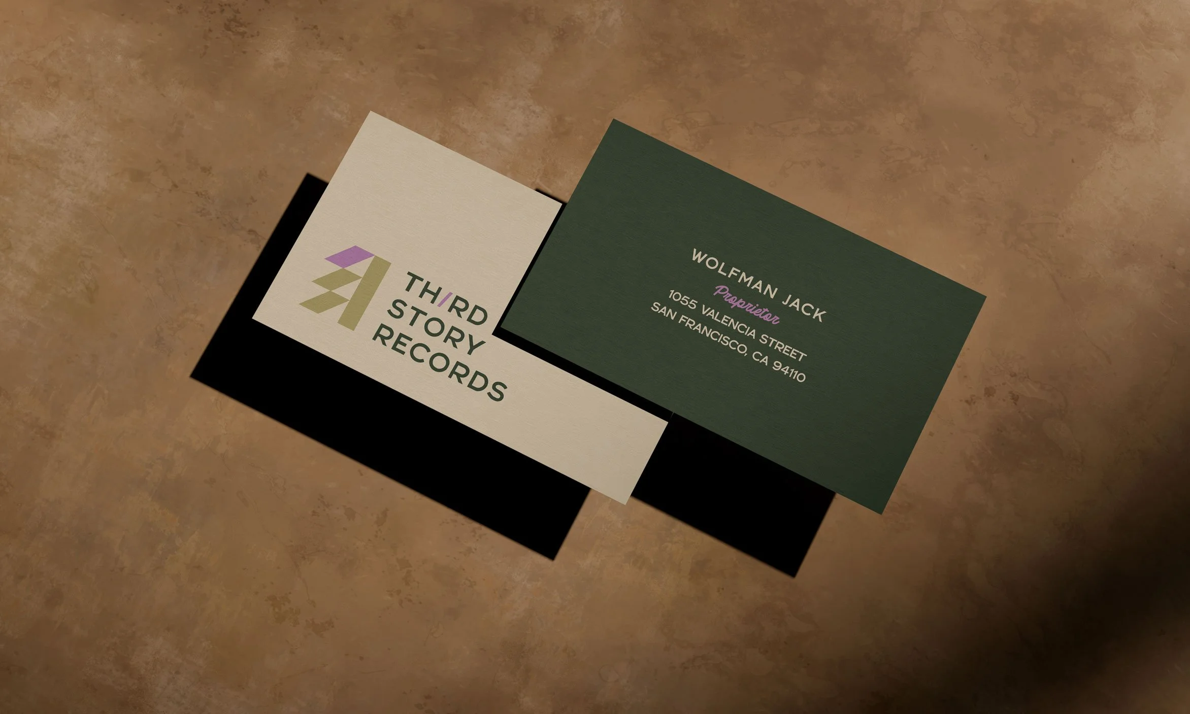
Third Story Records
PROJECT: Branding
CLIENT: Self-Initiated/Conceptual
ROLE: Art Direction ▪ Brand/Visual Identity ▪ Copywriting
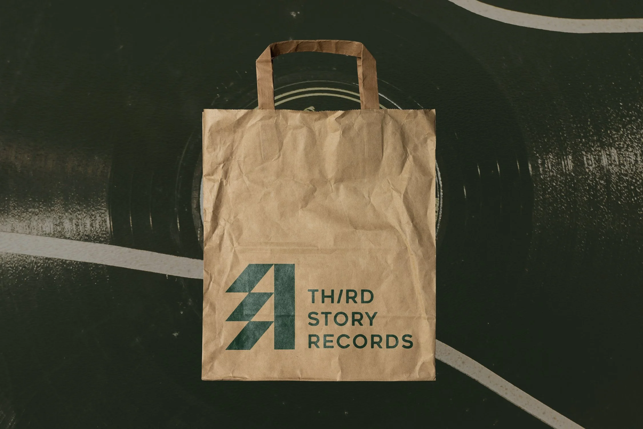
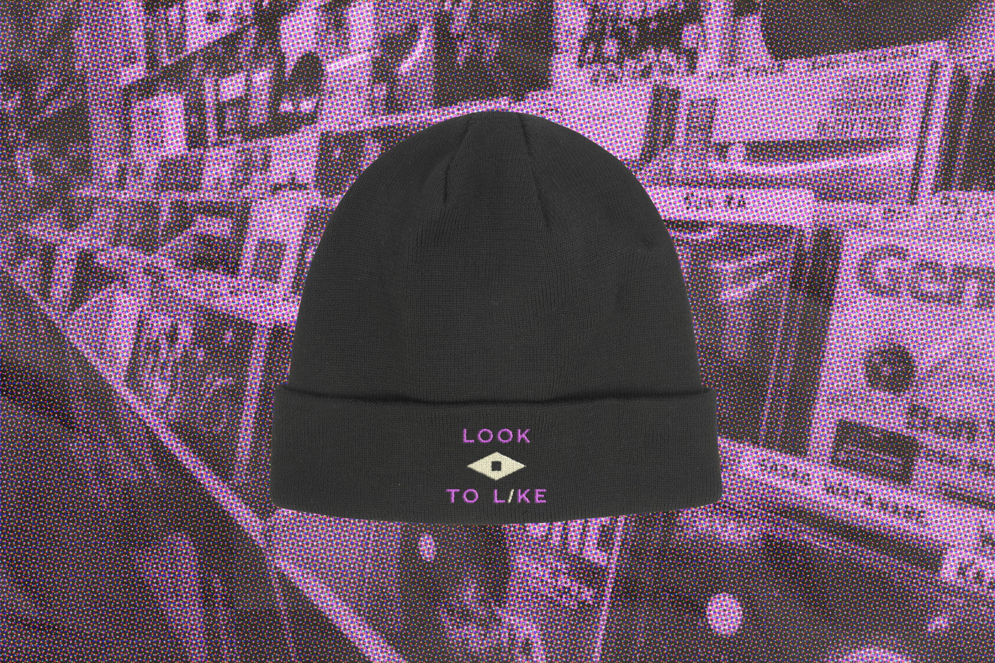
In an era of frictionless, disposable streaming, Third Story Records champions the return to tangible media. Housed in a historic former recording studio in downtown Chicago, the brand’s mission is to foster a culture of appreciation and connection. The primary design challenge was to actively dismantle the intimidating, 'music snob' atmosphere typical of indie record shops, and build a visual identity that invites discovery.
To solve this, I bypassed overly polished, contemporary trends and built a visual system rooted in Swiss Modernism—a deliberate nod to the foundational album art of the 50s and 60s. By pairing this structured, classic typography with a warm, tactile color palette, the brand identity feels less like an exclusive club and more like a welcoming, hands-on archive. Strategic copywriting, utilizing classic taglines like 'Stop, Look, Listen' and 'Look to Like,' is woven throughout the brand's touchpoints—from custom record sleeves and canvas tote bags to in-store signage. The resulting identity provides the Third Story Records customer with a distinct, approachable badge of honor: they aren't just consumers; they are a different kind of music lover.
COLORS
PROGRAMS USED

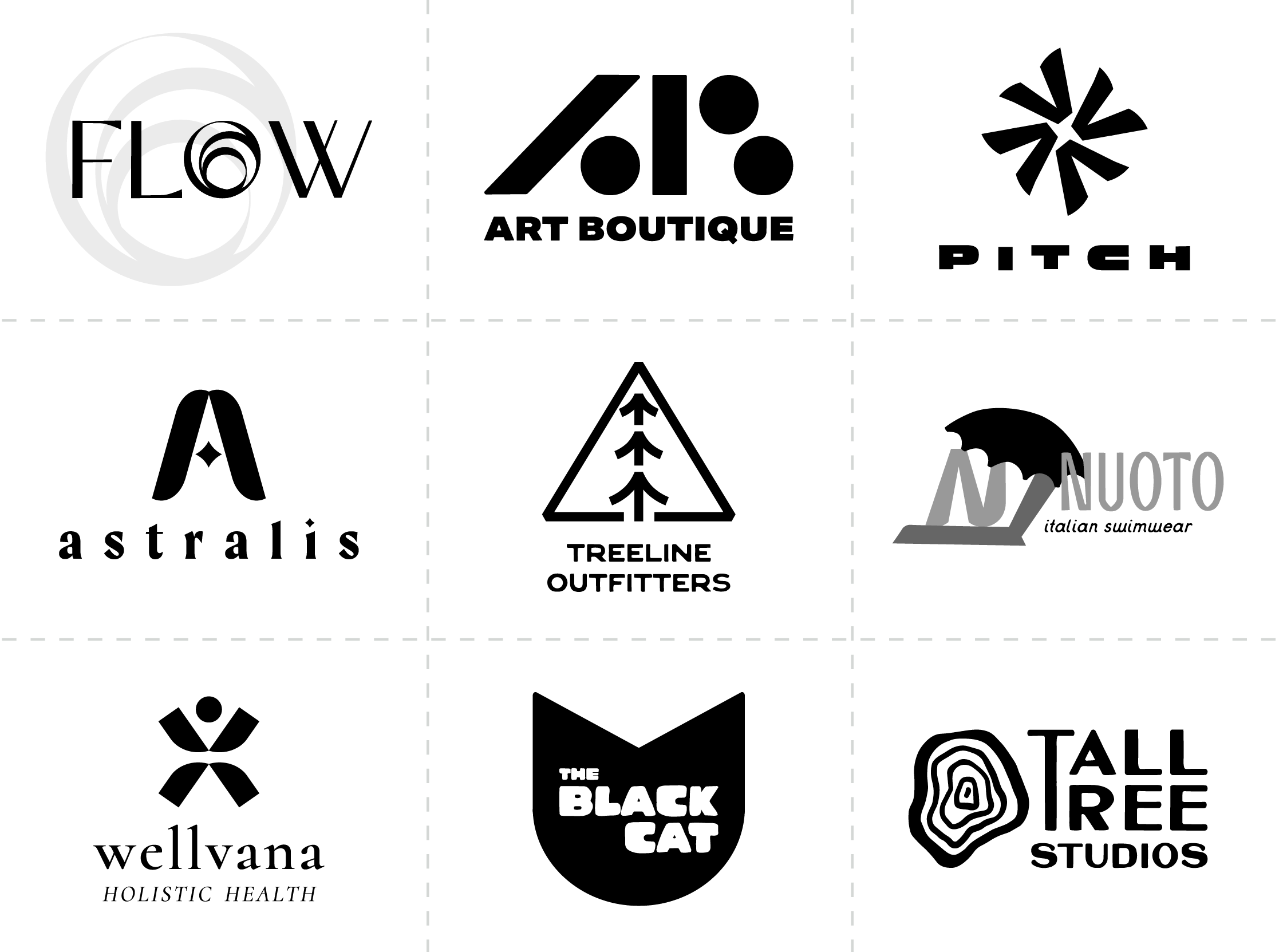
Logofolio
BRANDING (CONCEPTUAL)
Additional logo concepts I have created over the years for fictional companies. I use these to showcase my work as I have begun to expand my freelance business outside of the public policy space. These demonstrate how well my skillset translates to commercial brands.
PROGRAMS USED