New Website Under Construction
×
Squarespace Won't Stop Breaking
×
New Website Under Construction × Squarespace Won't Stop Breaking ×
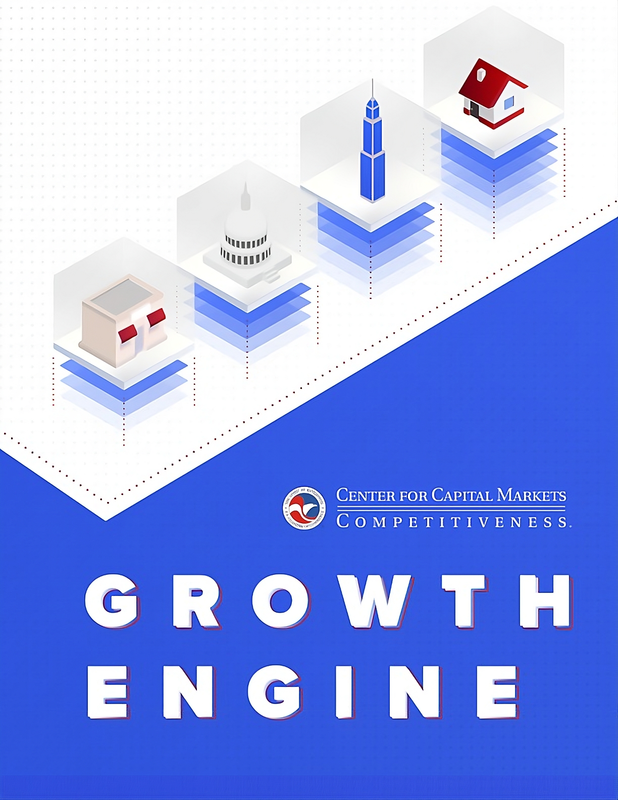
U.S. Chamber of Commerce Growth Engine Report
REPORT DESIGN AND LAYOUT
The Center for Capital Markets Competitiveness’ (CCMC) mission is to advance America’s global leadership in capital formation by supporting diverse capital markets that are the most fair, transparent, efficient, and innovative in the world. CCMC advocates on behalf of American businesses to ensure that legislation and regulation strengthen our capital markets allowing businesses—from the local flower shop to a multinational manufacturer—to mitigate risks, manage liquidity, access credit, and raise capital.
The challenge with this project was to develop a design depicting the sprawling topics of this report while conveying optimism about financial recovery through innovation. I used custom isometric designs, bright colors and subtle gradients to illustrate the different major economic components, while making the content appealing and relatable.
MADE IN


MADE IN
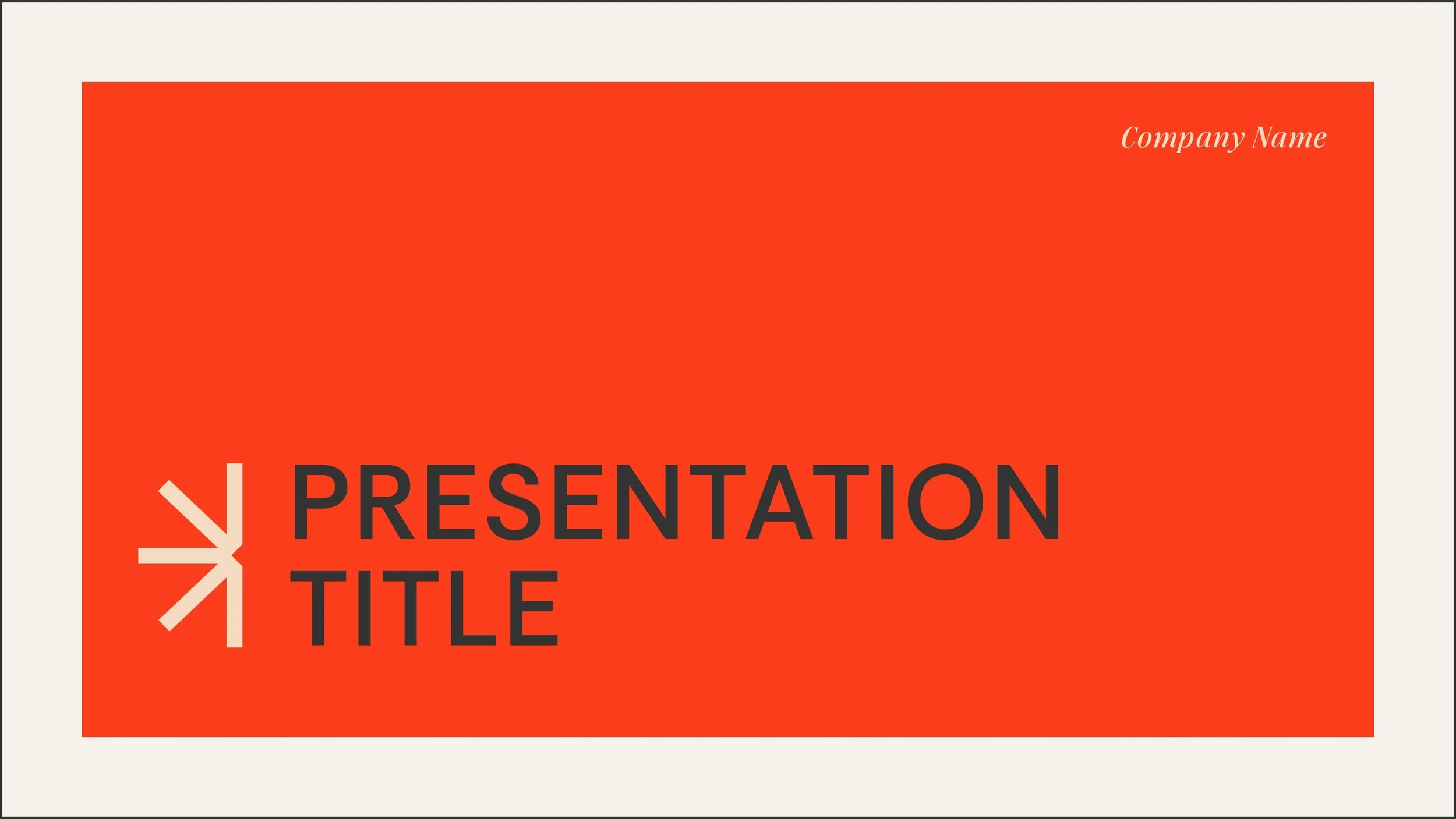
Pitch Deck Template
PROJECT: Modern Pitch Deck Framework
CLIENT: Self-Initiated/Conceptual
ROLE: Presentation System ▪ Narrative Slide Layouts ▪ Data Viz Components
Great design shouldn’t go to waste. This bright, modern pitch deck template was born from the creative upcycling of an unused client branding concept. I had a hard time letting go of this one because I saw its potential, so I repurposed the underlying aesthetic to build a versatile, highly functional presentation framework tailored for startups and modern brands looking to pitch their ideas effectively.
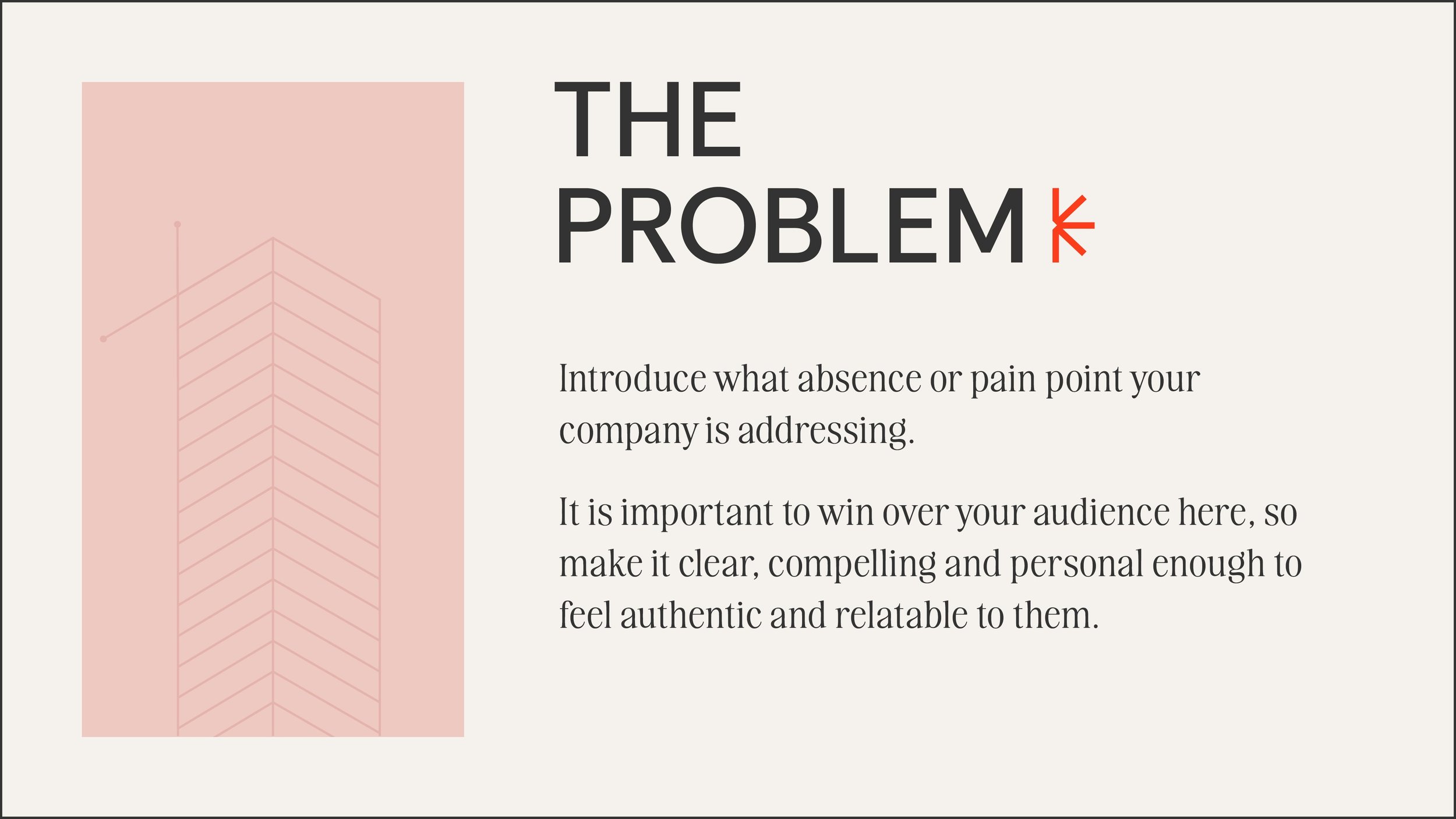
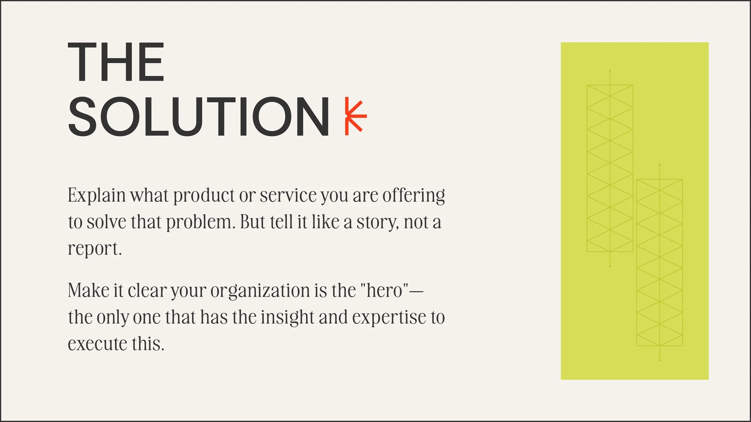
Like most slide decks, the primary problem to solve here was managing the information load—how to prevent presenters from cramming too much text onto a single screen. My solution was to design a system that actively guides the user toward better storytelling, forcing a structured narrative while remaining flexible enough to adapt to different industries and brand voices.
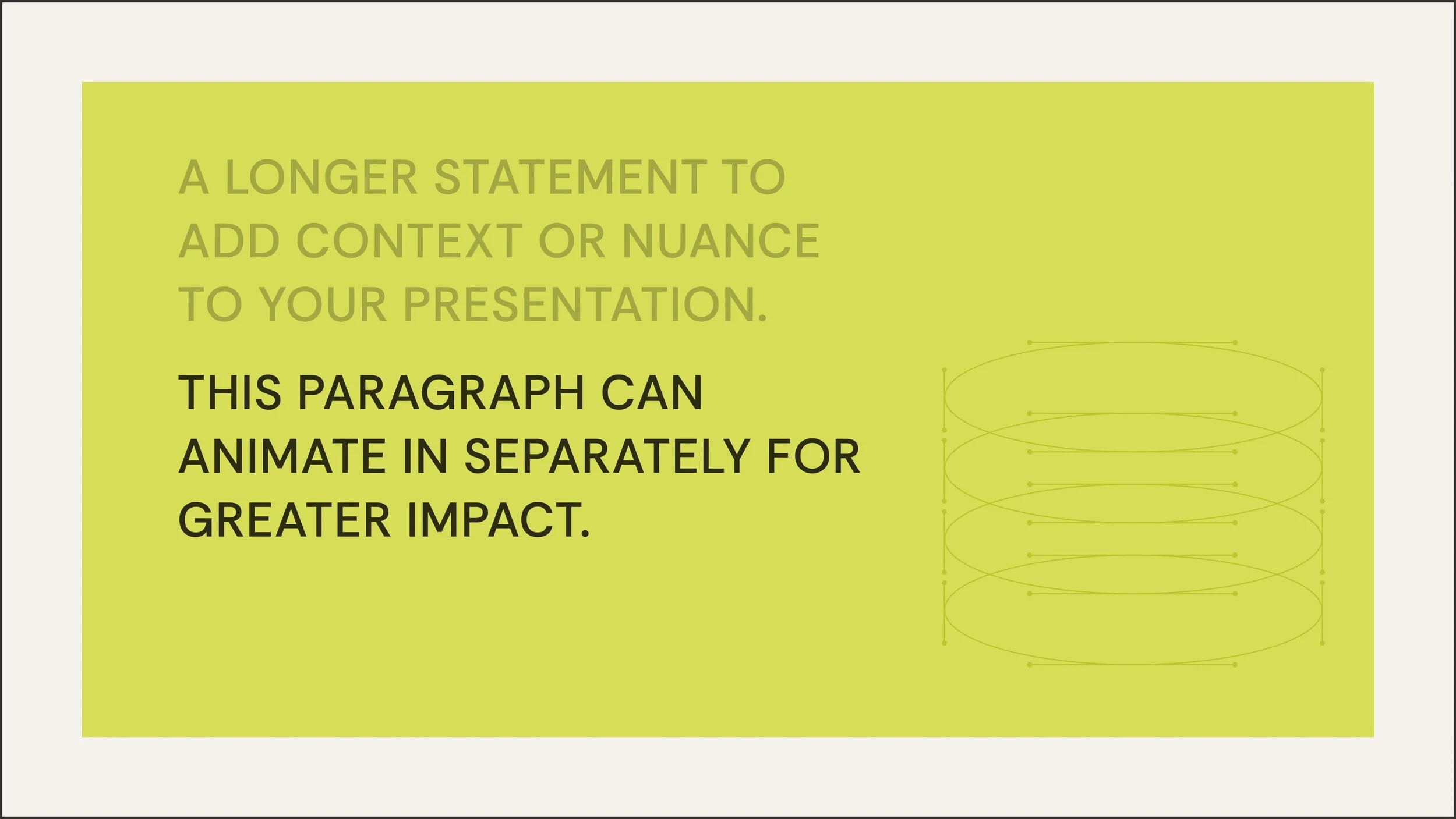
I overhauled the original color palette, opting for bright, energetic tones that project confidence and modernity, balanced by plenty of negative space. The typography was updated to prioritize extreme legibility, utilizing clean, robust sans-serifs that maintain clarity whether projected on a screen or viewed on a laptop.
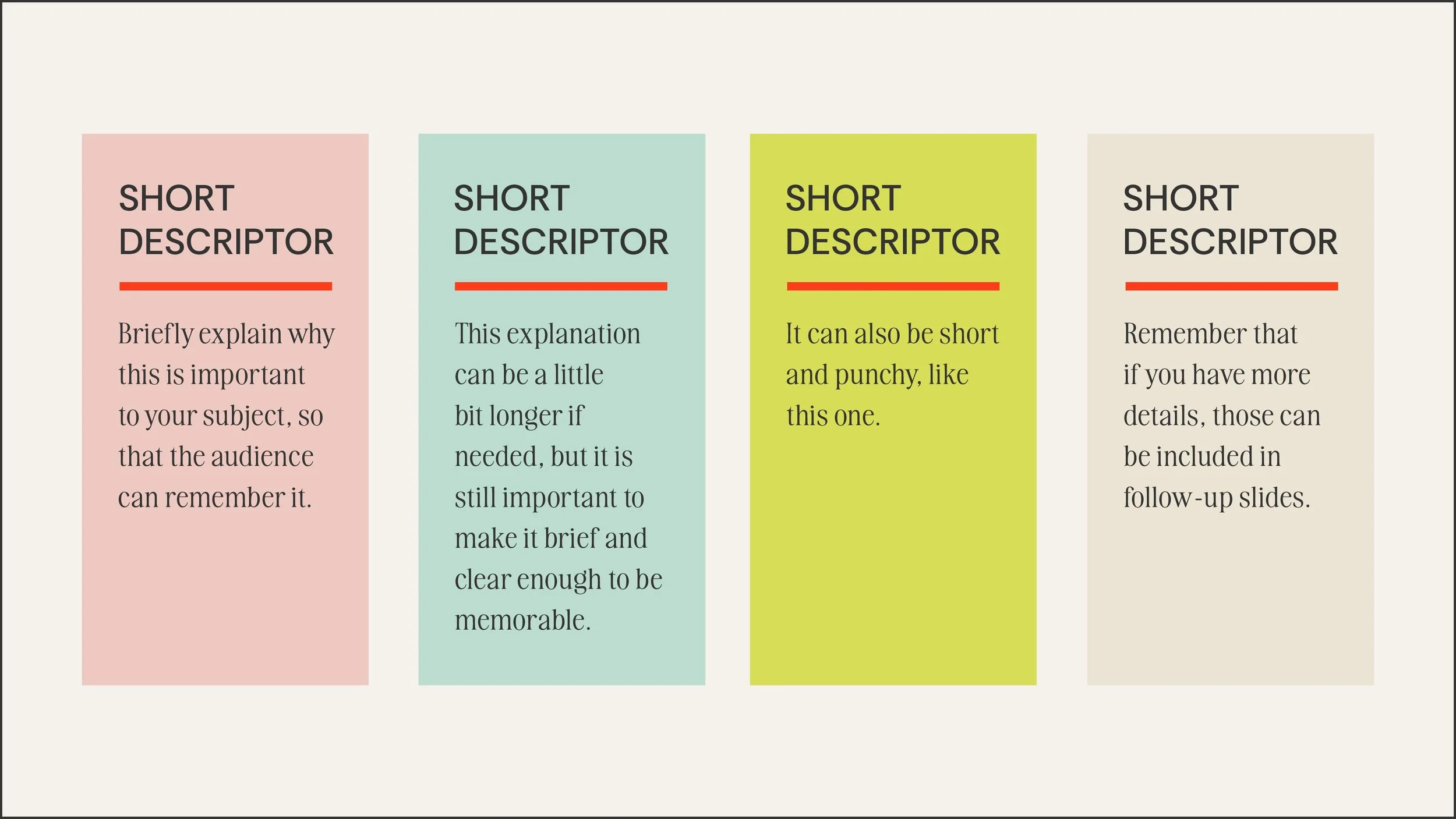
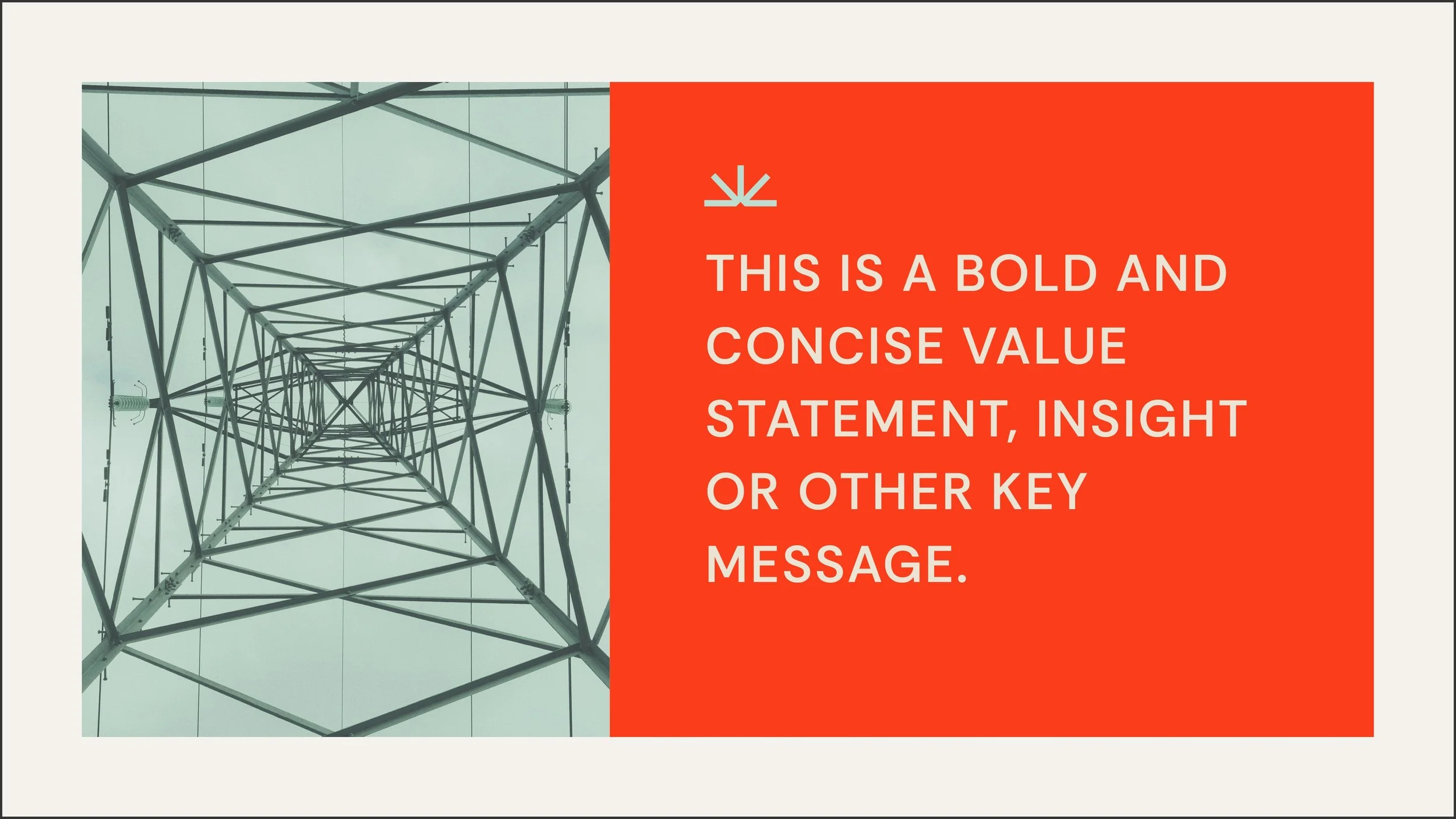
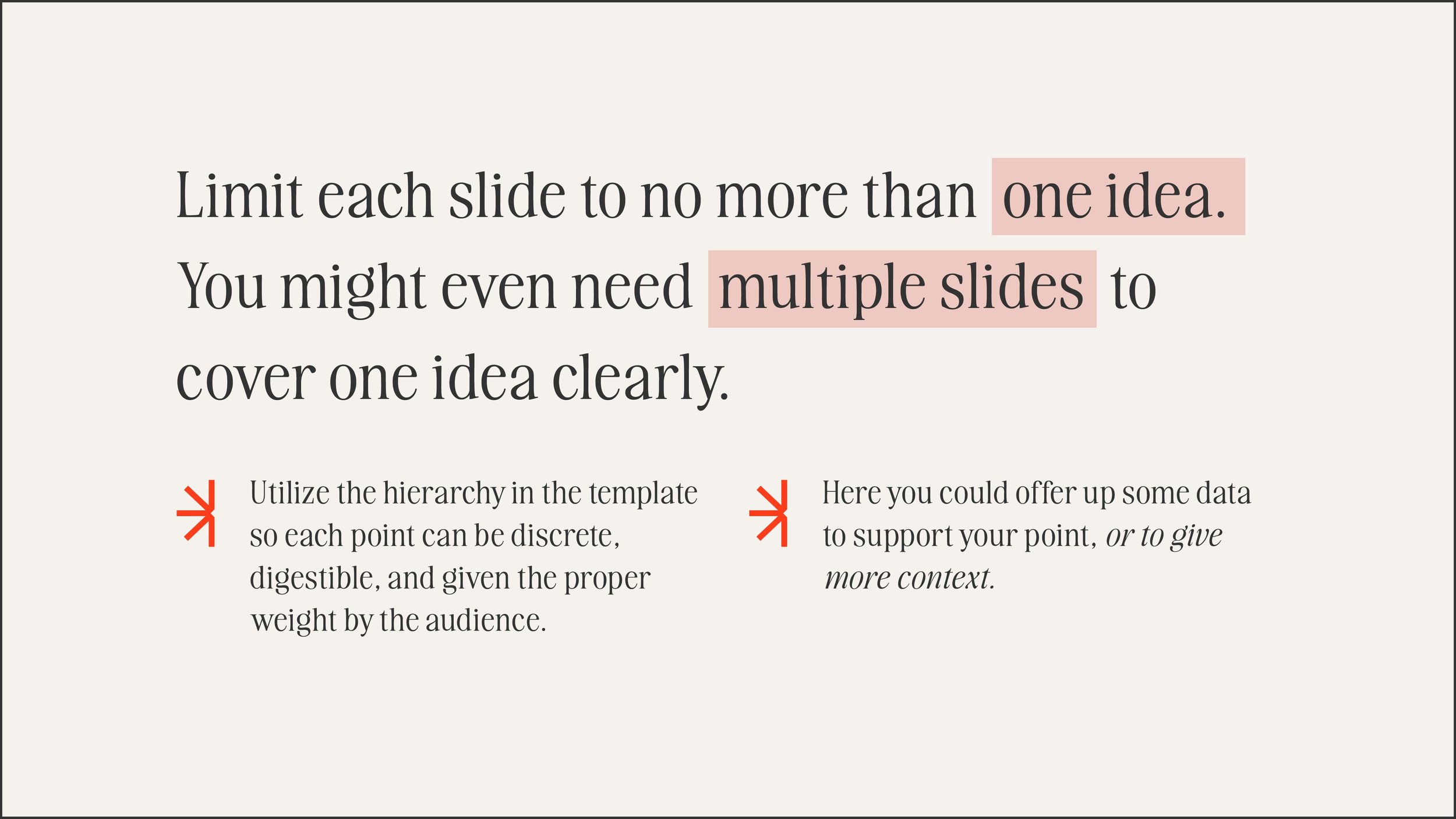
To solve the problem of dense information, the layouts were rigidly structured around a "one key idea per slide" philosophy. The visual hierarchy uses scale and contrast to draw the eye immediately to the most critical data point or statement, ensuring the audience is digesting the information, not just reading it.
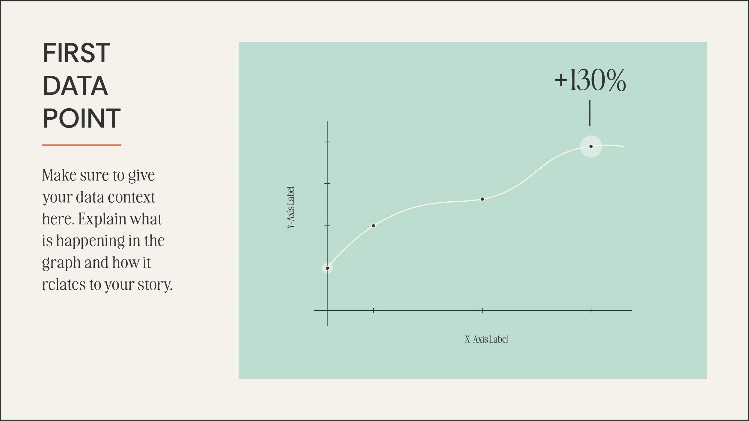
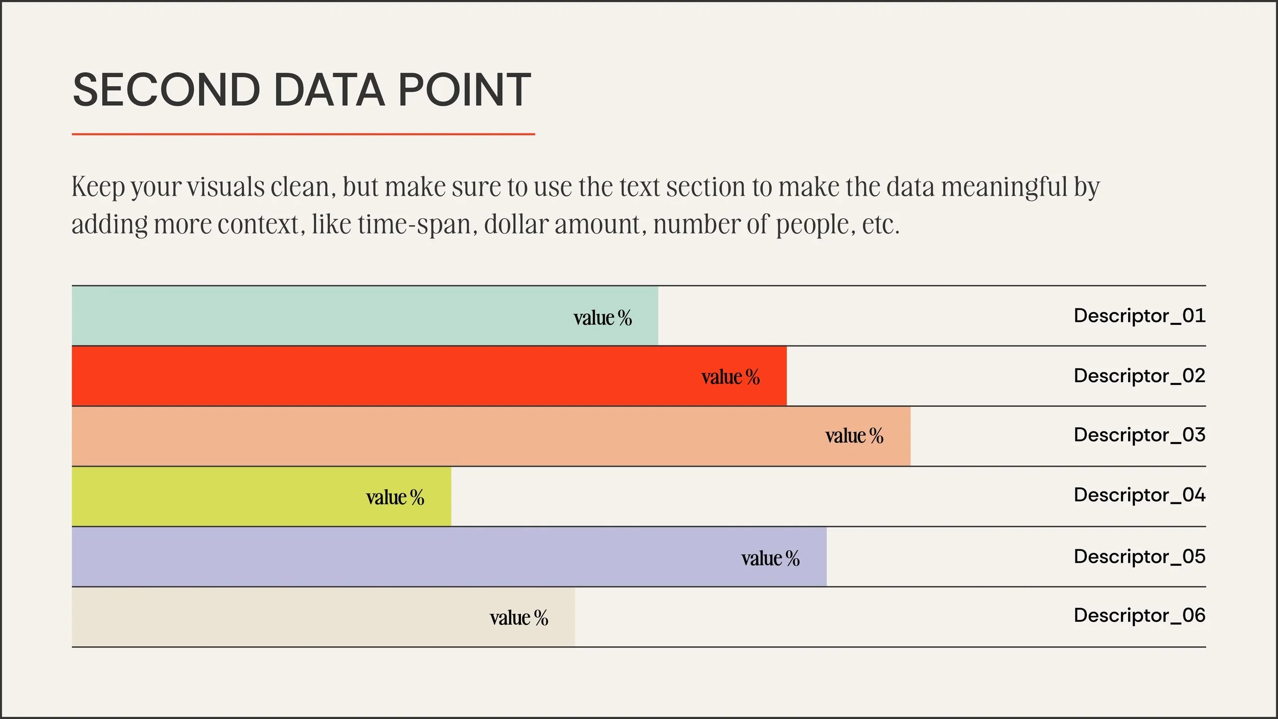
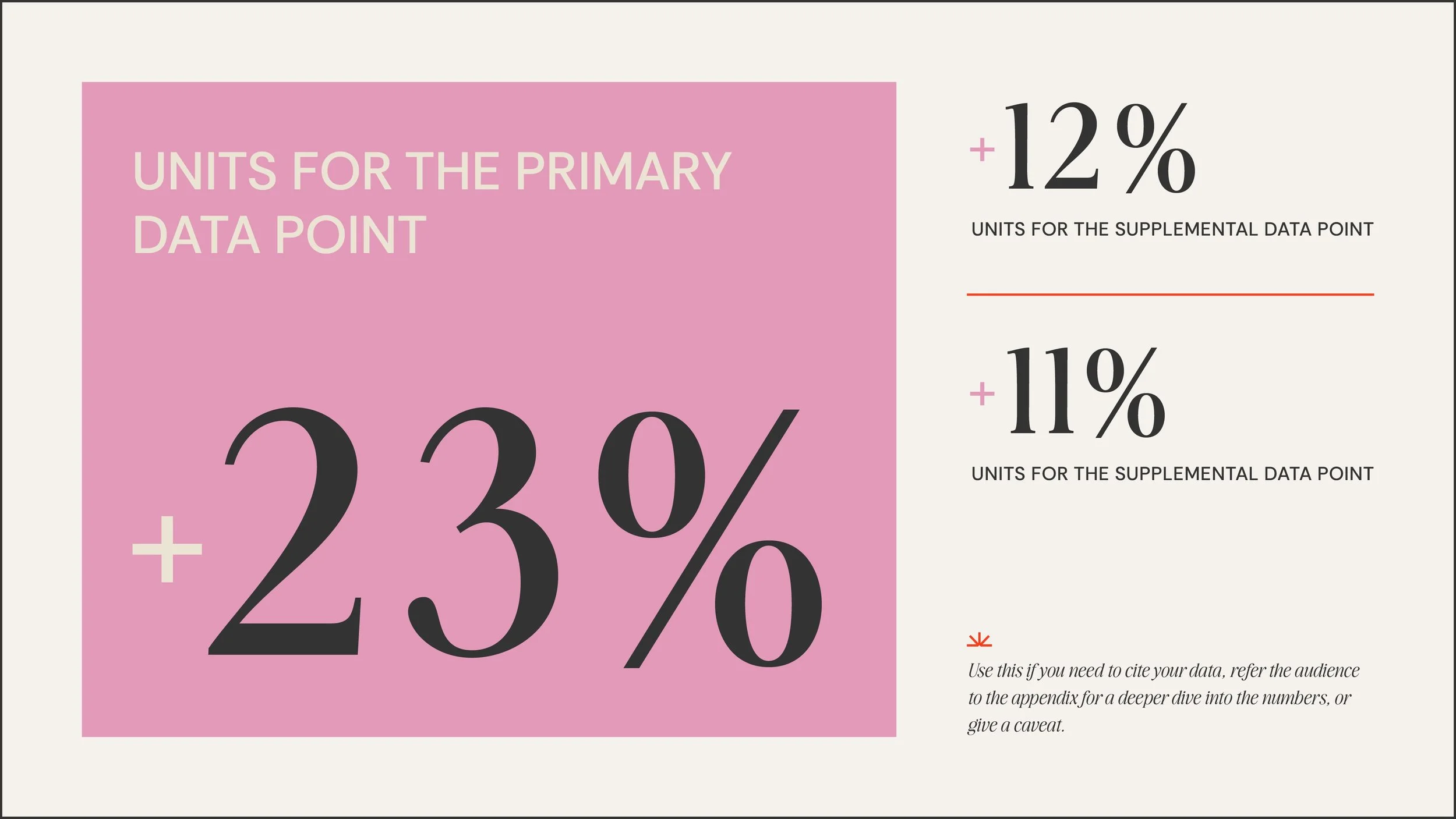
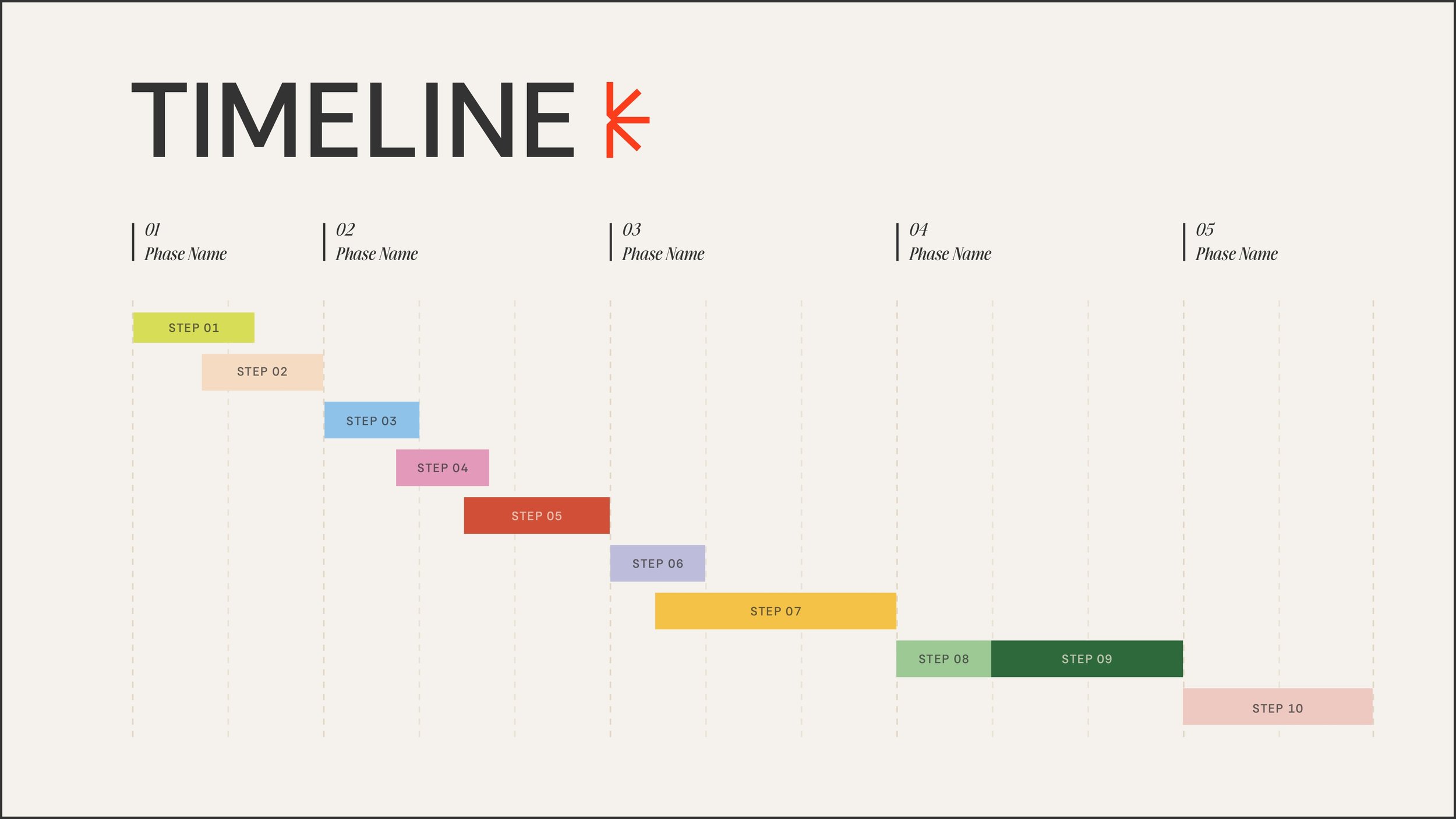
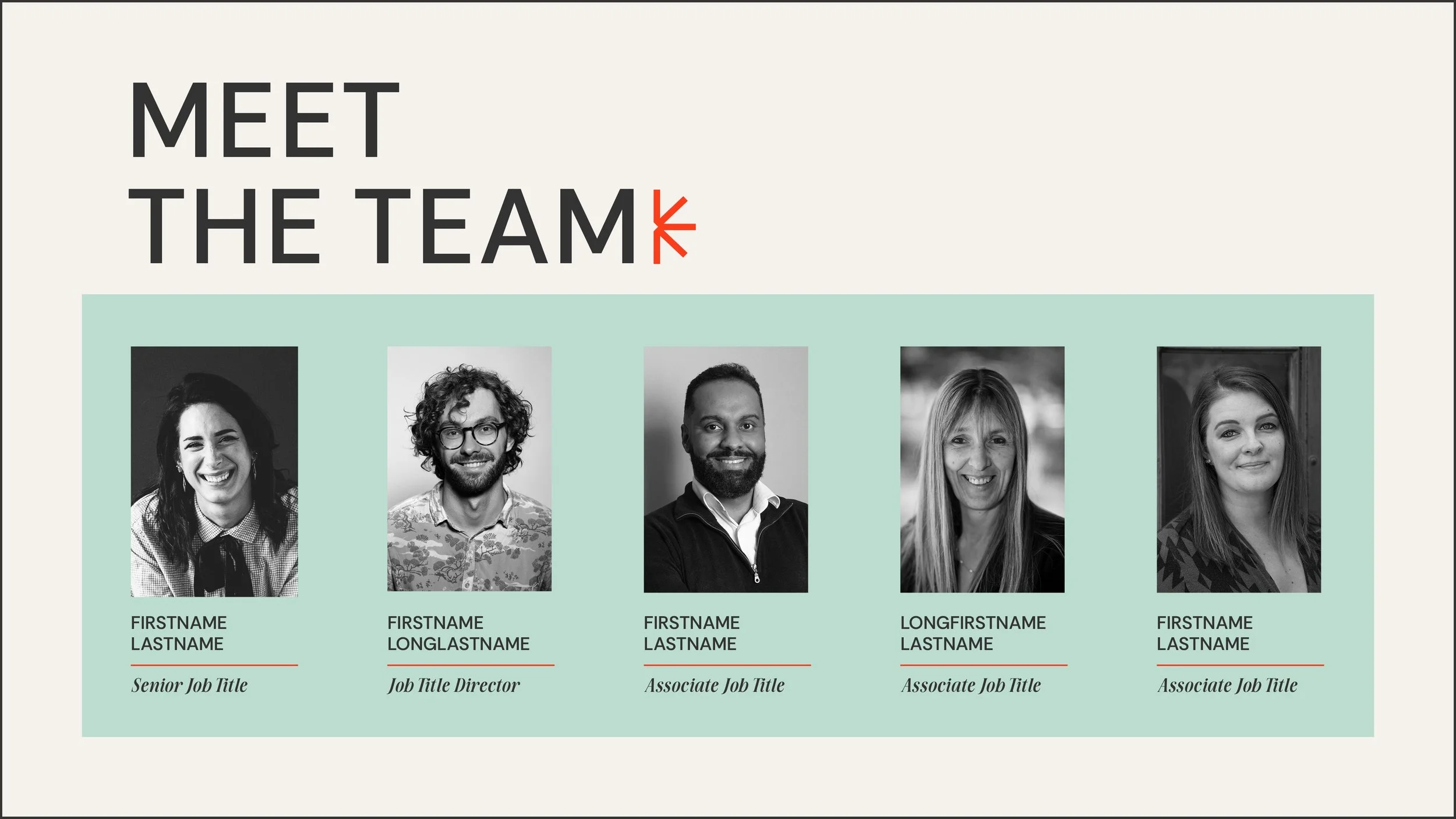
Rather than just providing blank canvas slides, I designed intentional, purpose-driven layouts. This includes dedicated narrative pacing slides—specifically designed for defining the "Problem" and "Solution"—as well as clean, modular timelines and data visualization graphics that turn complex numbers into clear visual stories.
This approach yielded a polished, structured presentation system that guides the user to craft a more effective pitch. By providing a foundation rooted in clean data visualization and clear, digestible storytelling, the framework empowers anyone to confidently present their next big idea.
Policies to Take Advantage of Falling Solar Hardware Costs
PROJECT: Editorial Framework for New Organization
CLIENT: Abundance Institute
ROLE: Core Asset Library ▪ Editorial Report Templates ▪ Visual System Development ▪ Data Visualization
I partnered with the Abundance Institute as a freelance partner prior to their official launch, tasked with taking their newly finalized core brand identity and expand it into a comprehensive, working visual ecosystem.
The system had to perform a difficult balancing act, simultaneously establishing trust across three distinct demographics by incorporating: (1) the forward-thinking edge expected by an emerging tech audience (2) the polished credibility required by lawmakers and legislative staff, and (3) the structured, rigorous traditionalism demanded by academic researchers.
To bridge that gap, I developed flexible editorial templates designed to scale as the Institute grew, starting with a foundation of generous white space and clean minimalism. This approach creates a highly legible, authoritative environment—essential for academics and legislators digesting dense policy—while maintaining the modern, uncluttered aesthetic expected in the tech sector. The layouts prioritize clear typography, structured information architecture, and digestible visual hierarchies, ensuring that complex arguments on outdated regulations are translated clearly.
I used the brand’s bold, primary color palette was utilized as strategic accents. In long-form applications like their policy and energy reports, these vibrant colors are used to guide the reader's eye, highlight key data points, and inject a sense of optimism and momentum without overwhelming the research.
The resulting asset library and report frameworks provide the organization with a credible, polished foundation that commands respect from academics and lawmakers while remaining visually engaging for the tech community.
MADE IN