

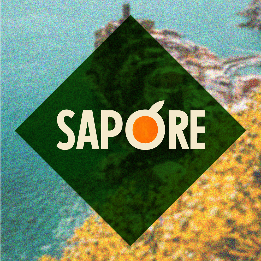
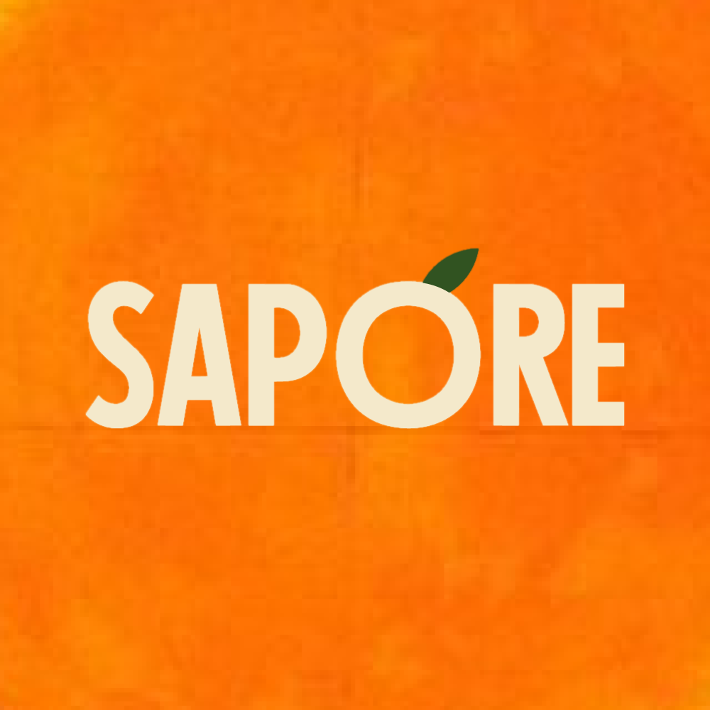
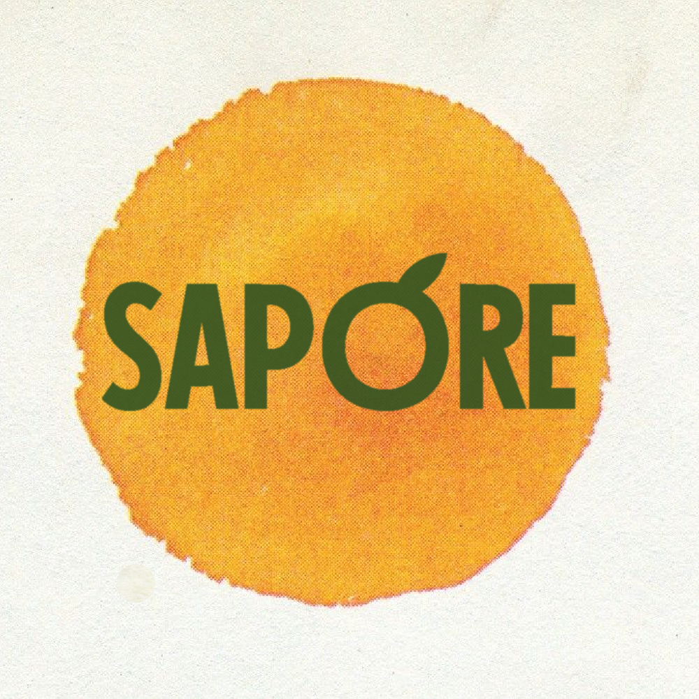
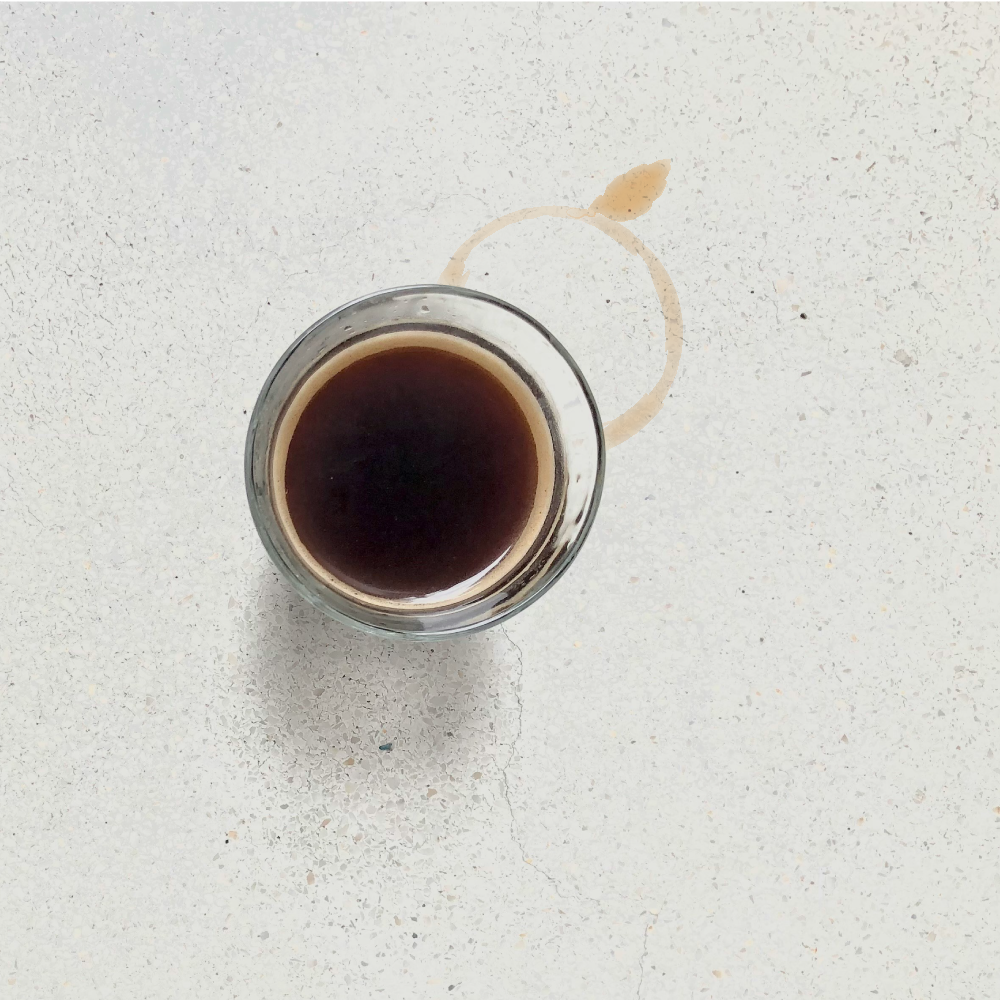
Sapore
PROJECT: Social Media Brand Kit
CLIENT: Self-Initiated/Conceptual
ROLE: Brand Design ▪ Visual Identity System ▪ Social Media Assets
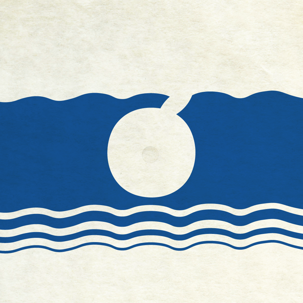
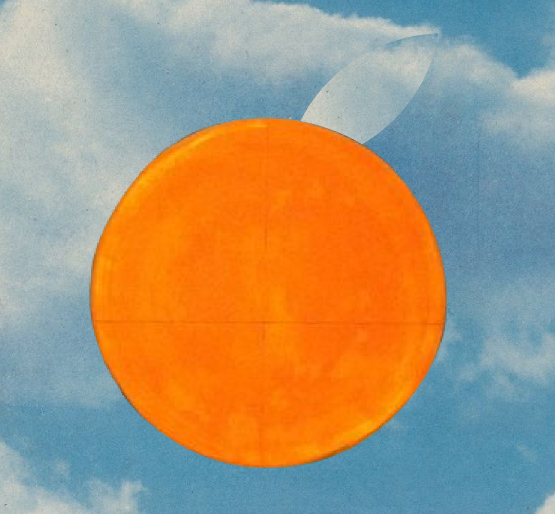
Sapore (Italian for flavor or taste) is a conceptual coffee shop built around a singular mission: to reclaim the lost art of the pause. In a highly digital, fast-paced world, Sapore invites patrons to savor the moment, disconnect from their screens, and spend quality time in the physical world. Inspired by the unhurried, deeply connected Italian way of life, the brand serves as a daily escape—a place where having a coffee is an event in itself, not just fuel for the grind.
The Challenge was to build a visual identity that feels transportive, nostalgic, and deeply human. The branding needed to communicate the rich heritage of Italian espresso culture, appeal to a modern audience craving a slower pace and a tangible, real-world aesthetic, and separate itself from the other hyper-stylized but often empty-feeling coffee brands.
The creative direction leans heavily into a warm, tactile aesthetic inspired by vintage Italian travel posters and mid-century packaging design, with modern touches.
The result was a cohesive, highly textured brand system that feels both nostalgic and refreshingly grounded (pun not intended, but also not retracted). Sapore’s identity breaks away from the minimalist, sterile aesthetic of modern cafes, offering instead a rich, immersive visual experience that invites the viewer to sit down, take a breath, and savor the world around them.
MADE IN


GNAR
PROJECT: Branding
CLIENT: Self-Initiated/Conceptual
ROLE: Art Direction ▪ Brand/Visual Identity ▪ Copywriting
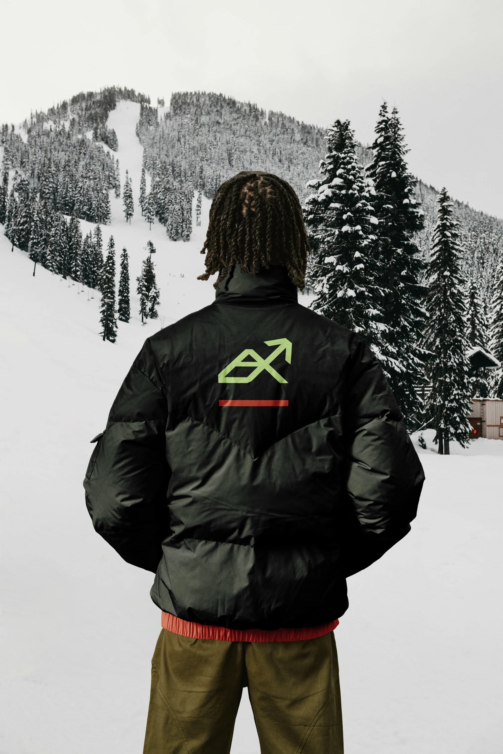
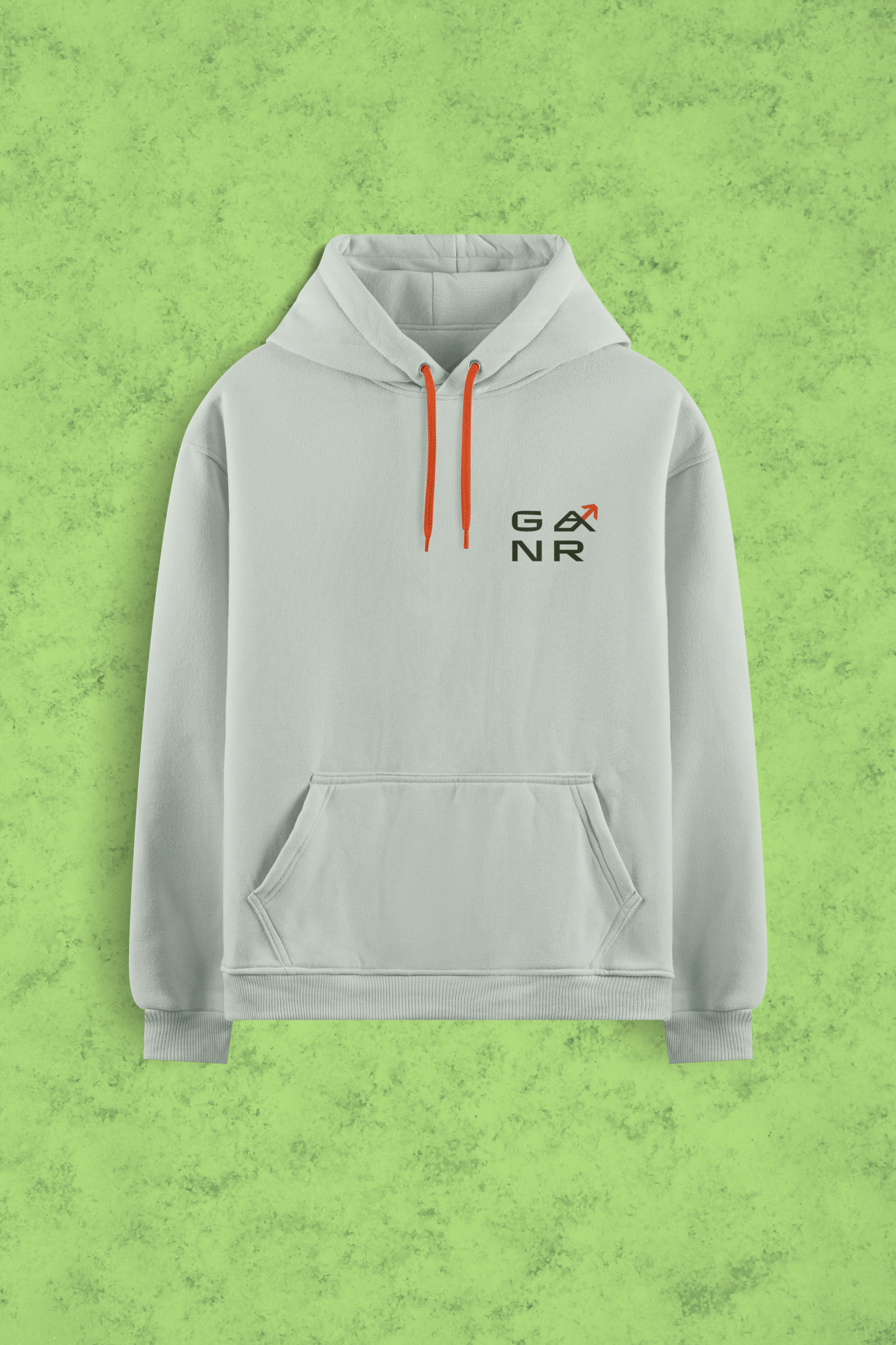
Snowboarding culture lives at the intersection of high-stakes performance and a laid-back, creative spirit. The challenge for GNAR, a Truckee-based apparel company, was to create a visual identity that resonates with the 'core' mountain athlete while appealing to the broader lifestyle consumer. The goal was to build a brand that feels as at home in a technical backcountry setting as it does in a casual urban environment.
The solution is a logo mark rooted in geometric momentum. By merging the silhouette of a mountain peak with the structural shape of the brand’s 'A,' I developed a mark that symbolizes both the ascent and the descent. The clean, bold lines offer the scalability required for technical gear—from laser-etched hardware to embroidered outerwear—ensuring brand recognition across diverse textures and scales. To balance the mark's precision, the color palette utilizes a high-contrast 'Evergreen' to anchor the brand in nature, while 'Electric Lime' and 'Bold Red' provide the high-visibility energy synonymous with mountain culture. This creates a versatile identity system that values quality over convenience, speaking to an audience that prioritizes both technical performance and authentic style.
MADE IN

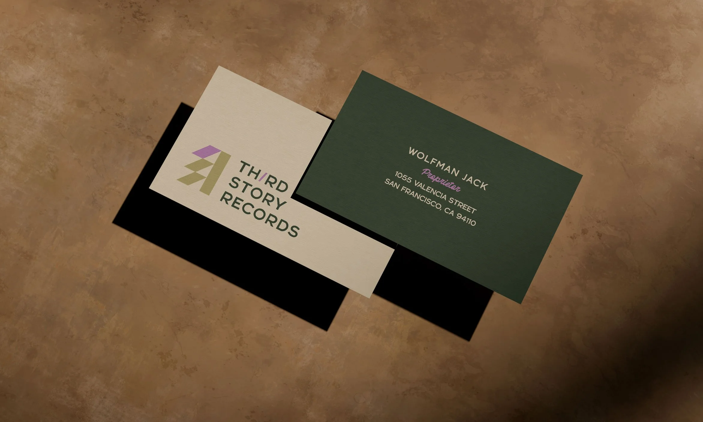
Third Story Records
PROJECT: Branding
CLIENT: Self-Initiated/Conceptual
ROLE: Art Direction ▪ Brand/Visual Identity ▪ Copywriting
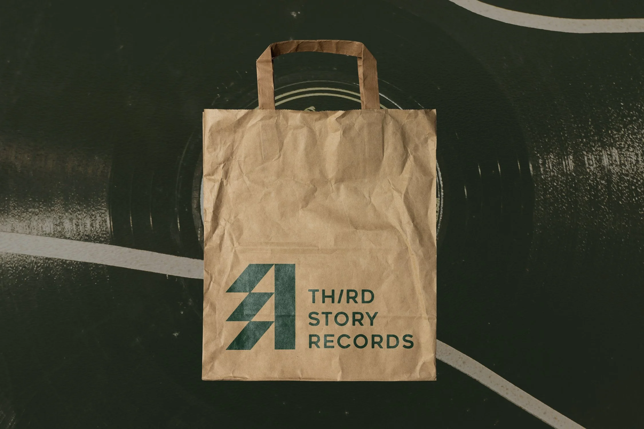
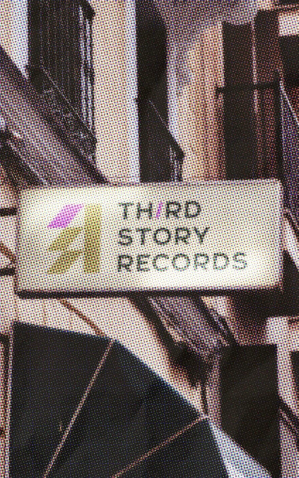
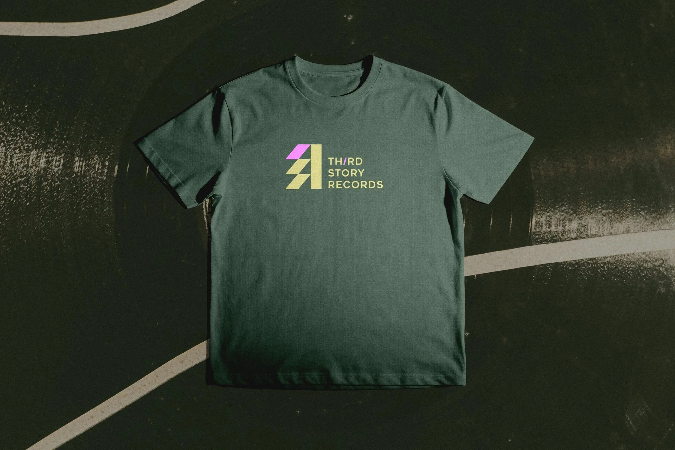
In an era of frictionless, disposable streaming, Third Story Records champions the return to tangible media. Housed in a historic former recording studio in downtown Chicago, the brand’s mission is to foster a culture of appreciation and connection. The primary design challenge was to actively dismantle the intimidating, 'music snob' atmosphere typical of indie record shops, and build a visual identity that invites discovery.
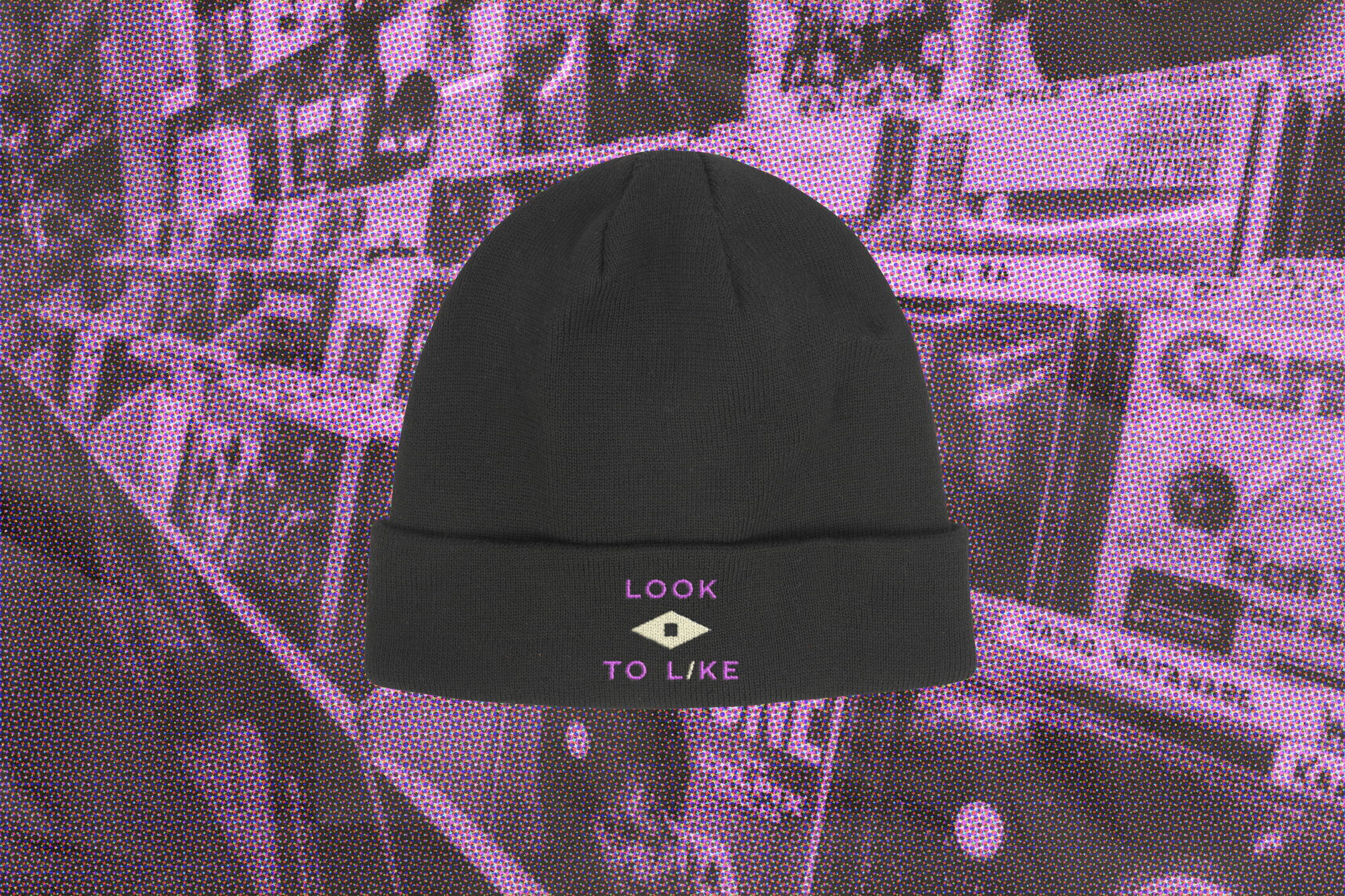
To solve this, I bypassed overly polished, contemporary trends and built a visual system rooted in Swiss Modernism—a deliberate nod to the foundational album art of the 50s and 60s. By pairing this structured, classic typography with a warm, tactile color palette, the brand identity feels less like an exclusive club and more like a welcoming, hands-on archive. Strategic copywriting, utilizing classic taglines like 'Stop, Look, Listen' and 'Look to Like,' is woven throughout the brand's touchpoints—from custom record sleeves and canvas tote bags to in-store signage. The resulting identity provides the Third Story Records customer with a distinct, approachable badge of honor: they aren't just consumers; they are a different kind of music lover.
MADE IN
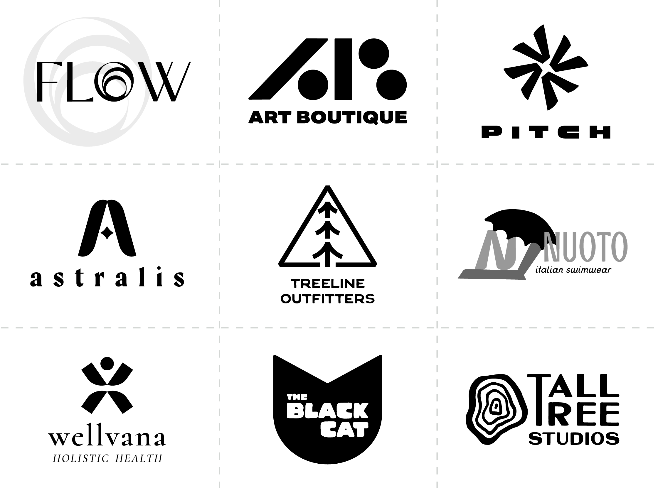
Logofolio
BRANDING (CONCEPTUAL)
Additional logo concepts I have created over the years for fictional companies. I use these to showcase my work as I have begun to expand my freelance business outside of the public policy space. These demonstrate how well my skillset translates to commercial brands.
MADE IN

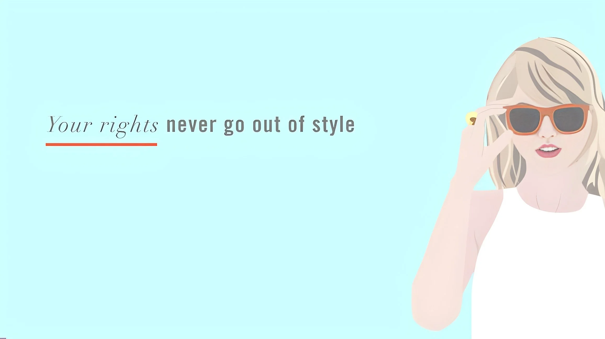
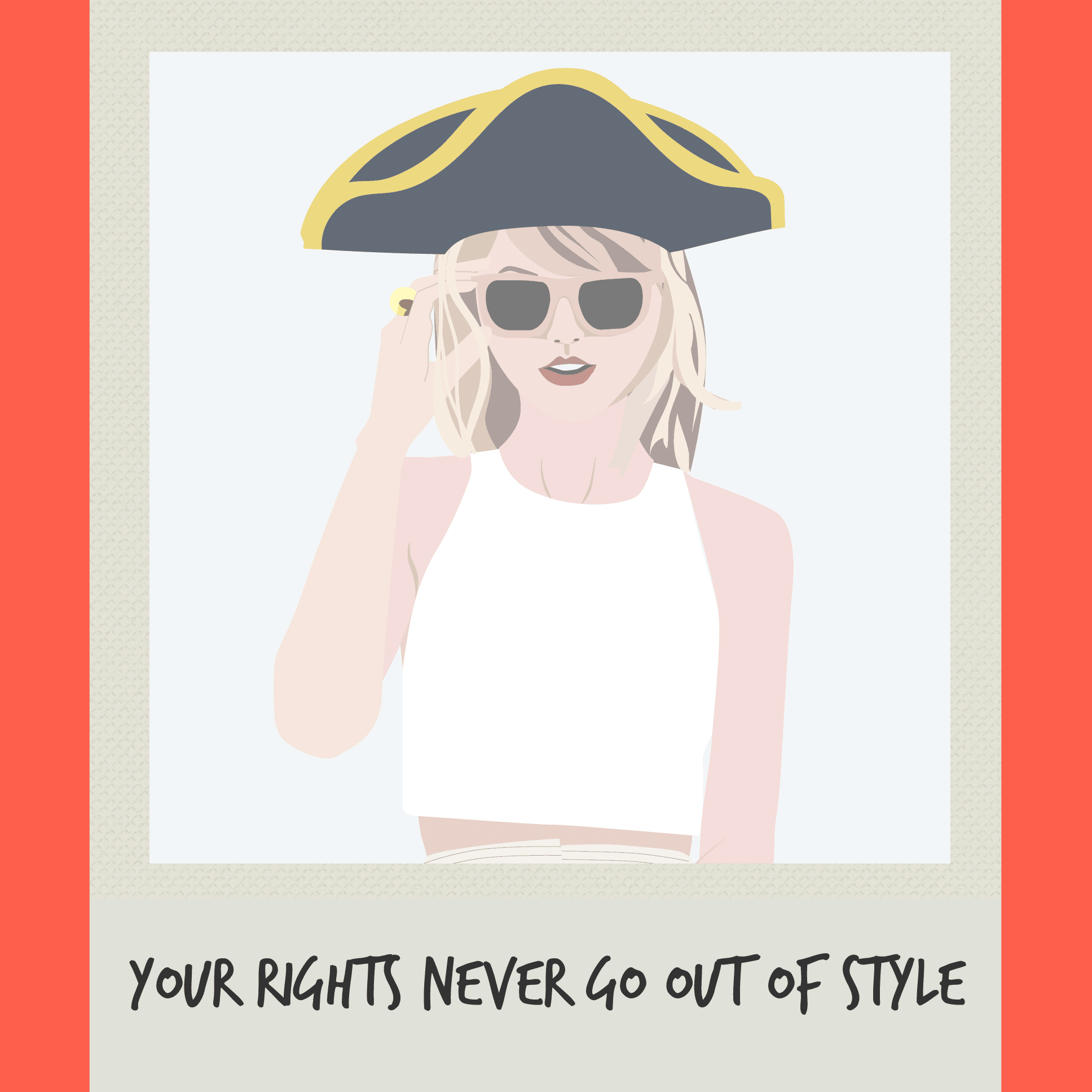
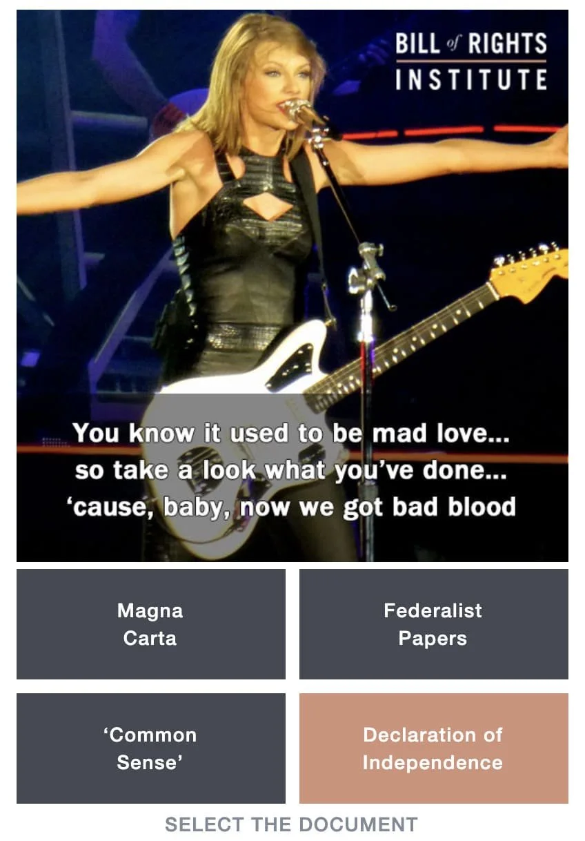
Swift Your Rights
PROJECT: Static Ad Creative
CLIENT: Bill of Rights Institute
ROLE: Illustration
Engaging high school students with civics and history requires cutting through the noise of a highly saturated social feed. For the Bill of Rights Institute, the strategy was to launch an interactive, web-based quiz—'Swift Your Rights'—promoted via targeted Instagram ads. The creative direction hinged on leveraging Taylor Swift’s massive cultural relevance, but we immediately hit a wall: strict image licensing regulations prevented the use of recognizable photography.
Rather than abandoning the concept or settling for generic stock imagery, I pivoted the visual strategy to custom illustration. This not only cleanly bypassed the legal constraints, but it unlocked a much stronger conceptual execution. By illustrating a highly recognizable pop-culture figure and integrating Revolutionary War-era visual elements—like a classic tricorne hat—the artwork became a proprietary, thumb-stopping asset. It seamlessly merged modern pop culture with 18th-century history, solving a complex legal challenge while perfectly capturing the attention of a Gen-Z audience.
MADE IN