
The best ideas rarely start fully polished.
They start as messy sketches, motion tests, and raw color explorations. This is an archive of a creative process driven by hands-on experimentation—where I play with new techniques, test visual theories, and see how tactile storytelling can solve real-world brand problems. It’s an ongoing exploration of bridging the gap between raw, analog aesthetics and strategic digital applications.
Analog Hi-Fi Catalog Concept
EDITORIAL DESIGN
This spec project explores the intersection of analog experiences and modernist grid systems. Designed as a conceptual hi-fi catalog or monthly zine, this series finds inspiration from mid-century editorial layouts, while maintaining a clean, contemporary edge. My approach was to strip down the design and let the underlying structure drive the visual narrative. The foundation of these layouts relies heavily on the rigid, mathematically precise grid systems popularized by mid-century Swiss design. To unify the campaign, a subtle, grainy paper texture is applied across all pieces, giving the digital designs the physical weight and visual presence of a classic coffee table book—as well as the fuzzy sound (and feeling) that can come from a record starting to spin.
The Musical Fidelity spread utilizes a visible, rigid grid to divide the composition, drawing the viewer's eye directly to the intricate mechanical details of the turntable. Taking cues from 1960s functionalism, the Soulnote page relies on a strict multi-square grid, mixing high-contrast, moody photography with punchy mustard yellow blocks and the direct typographic statement: "Cure your digital fatigue". The Yamaha layout embraces a warm, monochromatic mustard palette, using a graphic soundwave background to anchor the physical amplifier and visually represent the "transparent natural sound" promised by the seller. And The KLH Model Three layout balances the warmth of the vintage-inspired woodgrain speakers against a stark, dark teal geometric band and crisp, structured typography.
MADE IN


Cabron
SOCIAL VIDEO CONCEPT
A lot of the art I’m drawn to has an expressive, messy beauty, like charcoal, pastel and oil painting. So I had a lot of fun experimenting with how to put this artistic style into actual motion. This exploration is about breaking away from overly polished digital perfection and letting the texture drive the narrative. This unfiltered kinetic style disrupts a crowded social feed, making it highly effective for brand campaigns that need to evoke a strong emotional response and connect to their audience in a human way.
But its potential goes well beyond traditional ads. This rough, energetic aesthetic has great potential for the music space—whether it’s bringing an album campaign to life, creating animated Spotify canvases, or teasing a new merch drop. It strips away the corporate gloss and builds an immediate, authentic connection that makes an audience want to lean in.
MADE IN

Music Can Take You There
SOCIAL VIDEO CONCEPT
I’ve been exploring new ways to visualize how we actually consume audio. This piece kicks off a series marrying two of my biggest passions: the music industry and the intentional choice of quality over convenience. And I started with a song from Modest Mouse, one of my absolute favorite bands.
In a landscape dominated by fast, disposable streaming, audiences are deeply craving the tangible again—whether that’s a highly crafted album cover, limited-run merchandise, or a visualizer that demands your full attention. By blending a nostalgic, physical object with a surreal, atmospheric landscape, this exploration taps into that exact feeling. It’s a versatile visual language built for album rollouts, immersive Spotify Canvases, or any campaign that wants to slow the viewer down and offer an experience.
MADE IN

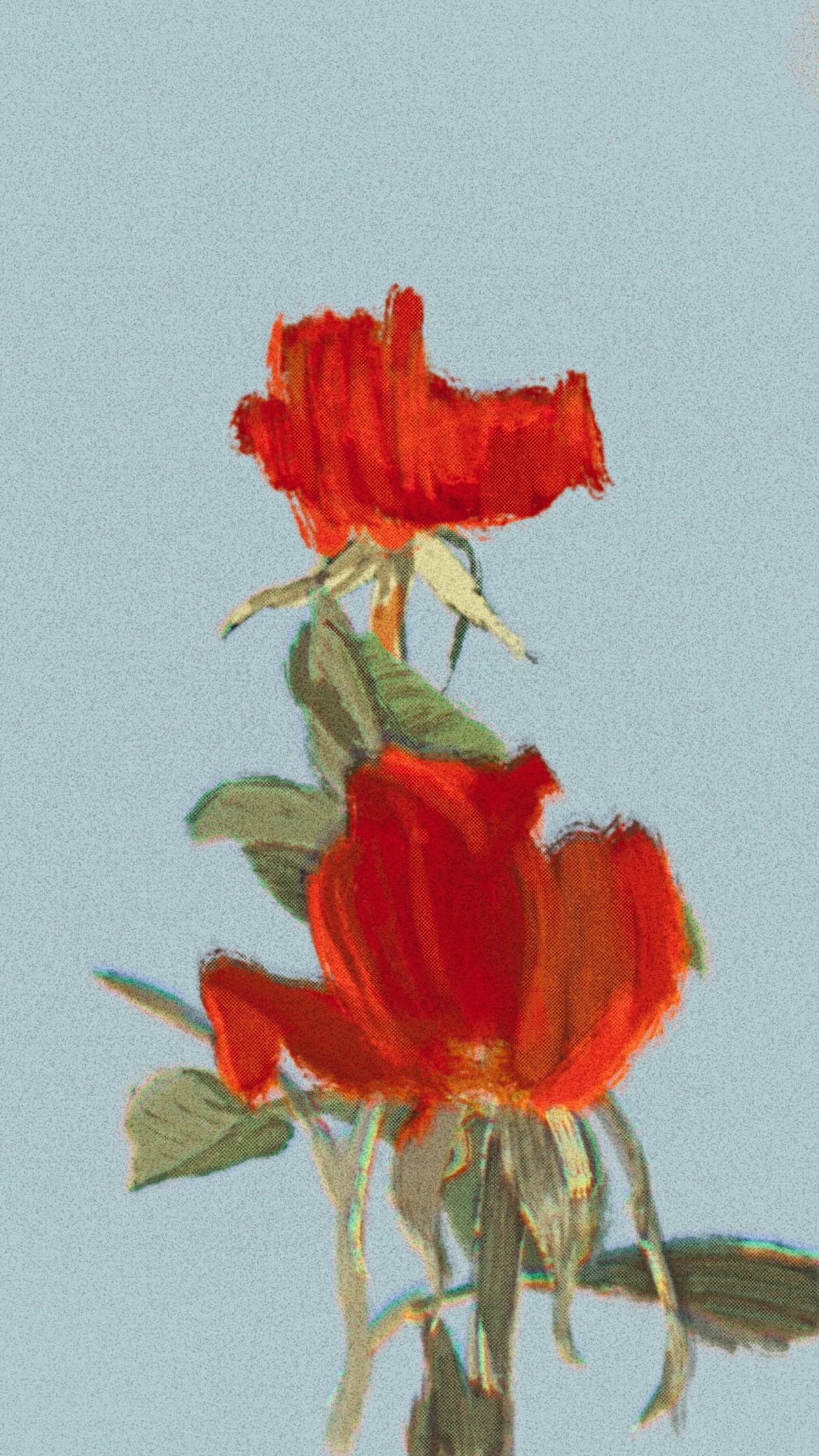
Flower Illustration
PROCREATE SKILL PRACTICE
As I transition my physical toolkit from chalk to oil pastels, I’ve been using Procreate as a digital sandbox to map out compositions and explore new color stories. Lately, I've been heavily drawn to the striking, aggressive energy of deep, saturated reds.
This piece is an exercise in adapting a more raw, tactile aesthetic into a digital workflow. It’s about finding new ways to inject a distinctly human, analog warmth into design, whether the final application is a brand campaign, an editorial illustration, or product packaging.
MADE IN
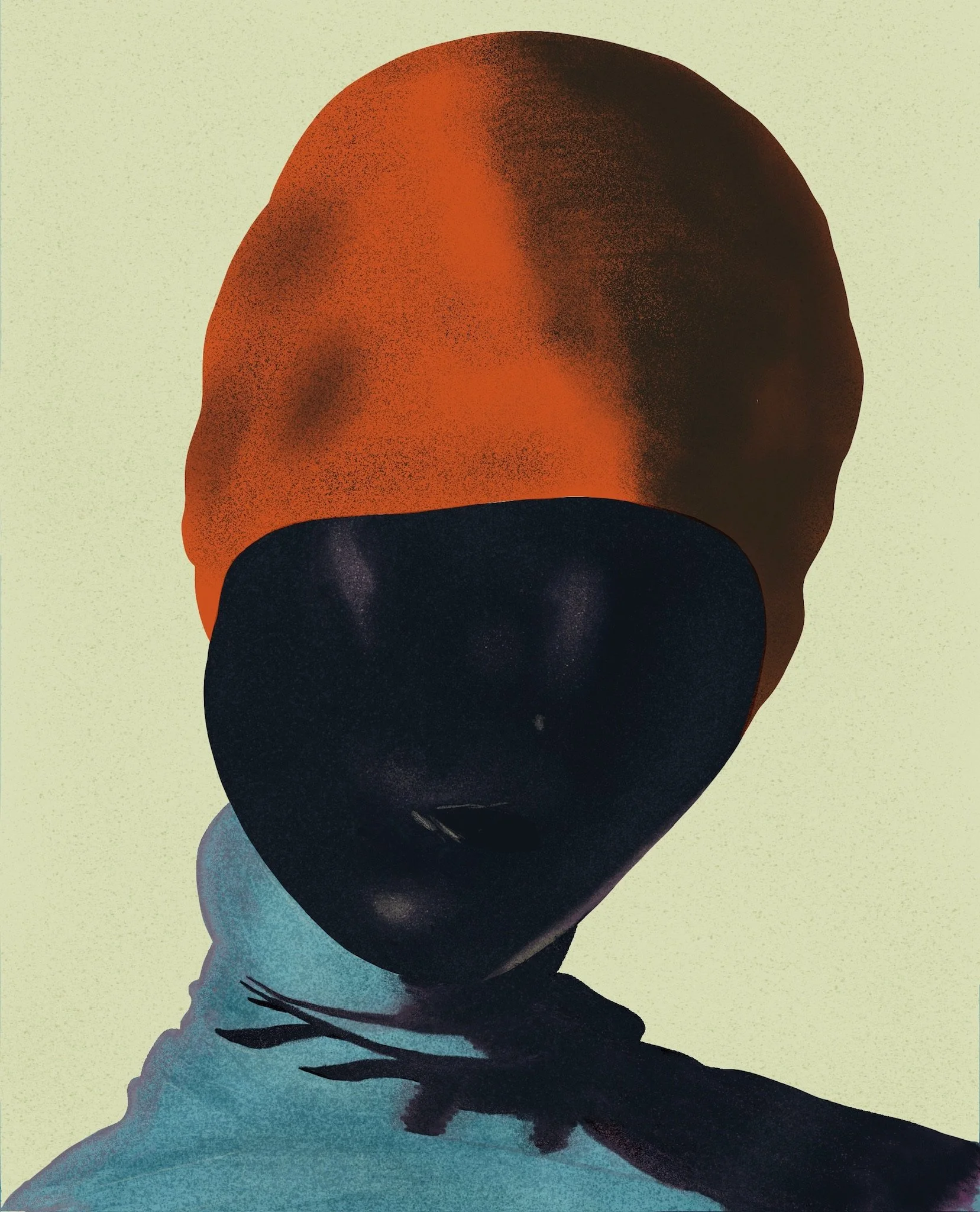
Digital Portrait
PROCREATE SKILL PRACTICE
I tried to duplicate some digital art from the duo SERIFA as a part of my ongoing effort to level up my Procreate skills.
I’m very drawn to their deeply contemplative, atmospheric style. Although they do a different process utilizing AI, I opted for a more “analog” digital approach by trying to match their signature softened contours, heavy noise, and filmic grain. I’ve got my eye on a personal project to try after I get a few more practice projects under my belt.
MADE IN
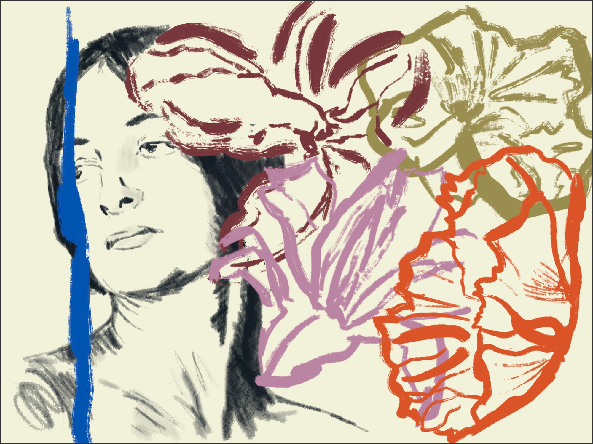
Georgia O’Keeffe Illustration
PROCREATE SKILL PRACTICE
In my free time I do a lot of drawing with chalk pastels, but lately supplies have been running low, so I’ve been experimenting with a more painterly style in Procreate.
After coming across a post about the rituals of famous creative women, Georgia O’Keefe really stayed on my mind. As much as I love her art, I am most affected by her as an artist—calm, self-possessed, original and brave.
MADE IN